Point pattern analysis
Introduction
We are using a dataset of crimes in a city. Start by reading in the data.
if (!require("rspat")) remotes::install_github("rspatial/rspat")
## Loading required package: rspat
## Loading required package: terra
## terra 1.9.21
library(rspat)
city <- spat_data("city")
crime <- spat_data("crime")
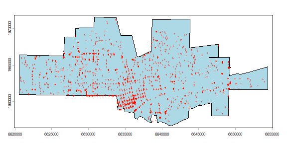
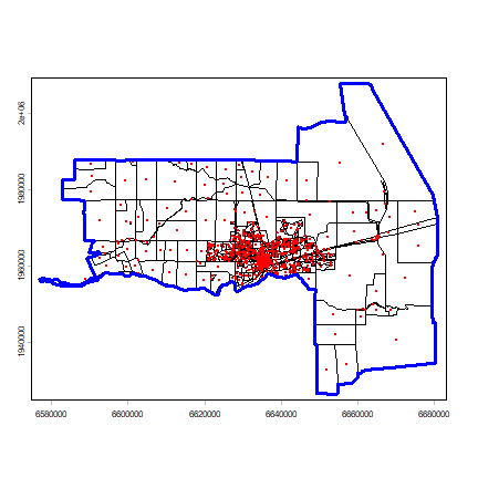
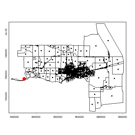
Here is a map of both datasets.
plot(city, col="light blue")
points(crime, col="red", cex=.5, pch="+")
A sorted table of the incidence of crime types.
tb <- sort(table(crime$CATEGORY))[-1]
tb
##
##                Arson              Weapons              Robbery
##                    9                   15                   49
##           Auto Theft   Drugs or Narcotics  Commercial Burglary
##                   86                  134                  143
##          Grand Theft             Assaults                  DUI
##                  143                  172                  212
## Residential Burglary     Vehicle Burglary      Drunk in Public
##                  219                  221                  232
##            Vandalism          Petty Theft
##                  355                  665
Let’s get the coordinates of the crime data, and for this exercise, remove duplicate crime locations. These are the “events” we will use below (later we’ll go back to the full data set).
xy <- crds(crime)
dim(xy)
## [1] 2661    2
xy <- unique(xy)
dim(xy)
## [1] 1208    2
head(xy)
##            x       y
## [1,] 6628868 1963718
## [2,] 6632796 1964362
## [3,] 6636855 1964873
## [4,] 6626493 1964343
## [5,] 6639506 1966094
## [6,] 6640478 1961983
Basic statistics
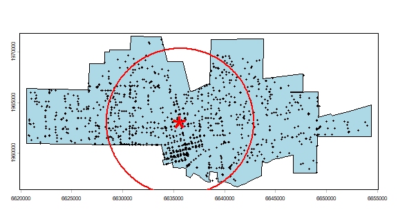
Compute the mean center and standard distance for the crime data.
# mean center
mc <- apply(xy, 2, mean)
# standard distance
sd <- sqrt(sum((xy[,1] - mc[1])^2 + (xy[,2] - mc[2])^2) / nrow(xy))
Plot the data to see what we’ve got. I add a summary circle (as in Fig 5.2) by dividing the circle in 360 points and compute bearing in radians. I do not think this is particularly helpful, but it might be in other cases. And it is always fun to figure out how to do tis.
plot(city, col="light blue")
points(crime, cex=.5)
points(cbind(mc[1], mc[2]), pch="*", col="red", cex=5)
# make a circle
bearing <- 1:360 * pi/180
cx <- mc[1] + sd * cos(bearing)
cy <- mc[2] + sd * sin(bearing)
circle <- cbind(cx, cy)
lines(circle, col='red', lwd=2)
Density
Here is a basic approach to computing point density.
CityArea <- expanse(city)
dens <- nrow(xy) / CityArea
Question 1a:What is the unit of ‘dens’?
Question 1b:What is the number of crimes per square km?
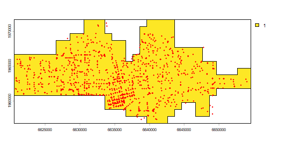
To compute quadrat counts I first create quadrats (a SpatRaster). I get the extent for the raster from the city polygon, and then assign an an arbitrary resolution of 1000. (In real life one should always try a range of resolutions, I think).
r <- rast(city, res=1000)
To find the cells that are in the city, and for easy display, I create polygons from the SpatRaster.
r <- rasterize(city, r)
plot(r)
quads <- as.polygons(r)
plot(quads, add=TRUE)
points(crime, col='red', cex=.5)
The number of events in each quadrat can be counted using the ‘rasterize’ function. That function can be used to summarize the number of points within each cell, but also to compute statistics based on the ‘marks’ (attributes). For example we could compute the number of different crime types) by changing the ‘fun’ argument to another function (see ?rasterize).
nc <- rasterize(crime, r, fun=length, background=0)
plot(nc)
plot(city, add=TRUE)
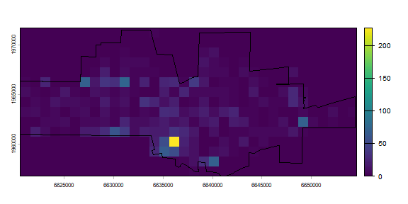
nc has crime counts. As we only have data for the city, the areas
outside of the city need to be excluded. We can do that with the mask
function (see ?mask).
ncrimes <- mask(nc, r)
plot(ncrimes)
plot(city, add=TRUE)
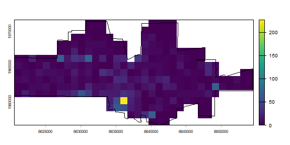
Better. Now the frequencies.
f <- freq(ncrimes)
head(f)
##   layer value count
## 1     1     0    53
## 2     1     1    28
## 3     1     2    21
## 4     1     3    29
## 5     1     4    18
## 6     1     5    14
plot(f, pch=20)
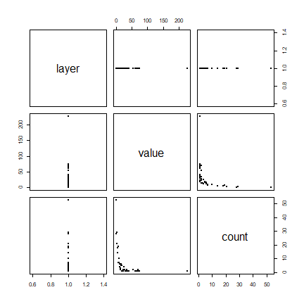
Does this look like a pattern you would have expected? Now compute the average number of cases per quadrat.
# number of quadrats
quadrats <- sum(f[,2])
# number of cases
cases <- sum(f[,1] * f[,2])
mu <- cases / quadrats
mu
## [1] 1
And create a table like Table 5.1 on page 130
ff <- data.frame(f)
colnames(ff) <- c('K', 'X')
ff$Kmu <- ff$K - mu
ff$Kmu2 <- ff$Kmu^2
ff$XKmu2 <- ff$Kmu2 * ff$X
head(ff)
##   K X <NA> Kmu Kmu2 XKmu2
## 1 1 0   53   0    0     0
## 2 1 1   28   0    0     0
## 3 1 2   21   0    0     0
## 4 1 3   29   0    0     0
## 5 1 4   18   0    0     0
## 6 1 5   14   0    0     0
The observed variance s2 is
s2 <- sum(ff$XKmu2) / (sum(ff$X)-1)
s2
## [1] 0
And the VMR is
VMR <- s2 / mu
VMR
## [1] 0
Question 2:What does this VMR score tell us about the point pattern?
Distance based measures
As we are using a planar coordinate system we can use the dist
function to compute the distances between pairs of points. If we were
using longitude/latitude we could compute distance via spherical
trigonometry functions. These are available in the sp, raster, and
notably the geosphere package (among others). For example, see
terra::distance.
d <- dist(xy)
class(d)
## [1] "dist"
I want to coerce the dist object to a matrix, and ignore distances from each point to itself (the zeros on the diagonal).
dm <- as.matrix(d)
dm[1:5, 1:5]
##           1        2         3         4         5
## 1     0.000 3980.843  8070.429  2455.809 10900.016
## 2  3980.843    0.000  4090.992  6303.450  6929.439
## 3  8070.429 4090.992     0.000 10375.958  2918.349
## 4  2455.809 6303.450 10375.958     0.000 13130.236
## 5 10900.016 6929.439  2918.349 13130.236     0.000
diag(dm) <- NA
dm[1:5, 1:5]
##           1        2         3         4         5
## 1        NA 3980.843  8070.429  2455.809 10900.016
## 2  3980.843       NA  4090.992  6303.450  6929.439
## 3  8070.429 4090.992        NA 10375.958  2918.349
## 4  2455.809 6303.450 10375.958        NA 13130.236
## 5 10900.016 6929.439  2918.349 13130.236        NA
To get, for each point, the minimum distance to another event, we can use the ‘apply’ function. Think of the rows as each point, and the columns of all other points (vice versa could also work).
dmin <- apply(dm, 1, min, na.rm=TRUE)
head(dmin)
##         1         2         3         4         5         6
## 266.07892 293.58874  47.90260 140.80688  40.06865 510.41231
Now it is trivial to get the mean nearest neighbour distance according to formula 5.5, page 131.
mdmin <- mean(dmin)
Do you want to know, for each point, Which point is its nearest neighbour? Use the ‘which.min’ function (but note that this ignores the possibility of multiple points at the same minimum distance).
wdmin <- apply(dm, 1, which.min)
And what are the most isolated cases? That is the furtest away from their nearest neigbor. I plot the top 25. A bit complicated.
plot(city)
points(crime, cex=.1)
ord <- rev(order(dmin))
far25 <- ord[1:25]
neighbors <- wdmin[far25]
points(xy[far25, ], col='blue', pch=20)
points(xy[neighbors, ], col='red')
# drawing the lines, easiest via a loop
for (i in far25) {
    lines(rbind(xy[i, ], xy[wdmin[i], ]), col='red')
}
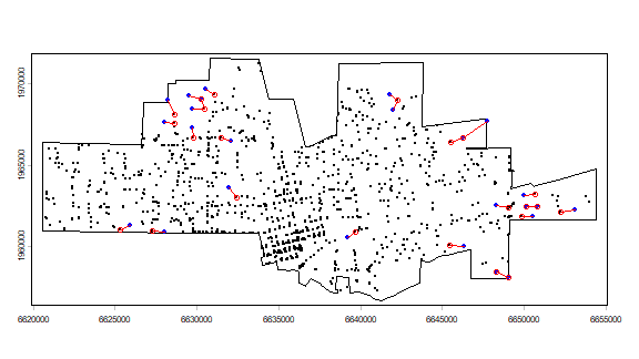
Note that some points, but actually not that many, are used as isolated and as a neighbor to an isolated points.
Now on to the G function
max(dmin)
## [1] 1829.738
# get the unique distances (for the x-axis)
distance <- sort(unique(round(dmin)))
# compute how many cases there with distances smaller that each x
Gd <- sapply(distance, function(x) sum(dmin < x))
# normalize to get values between 0 and 1
Gd <- Gd / length(dmin)
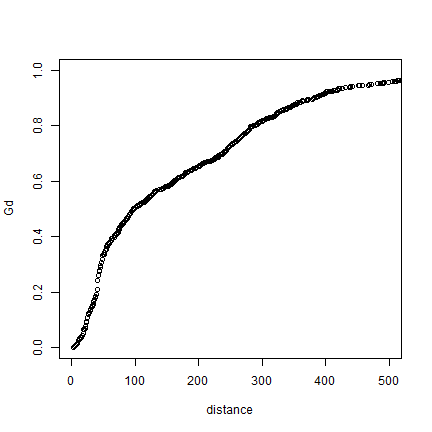
plot(distance, Gd)
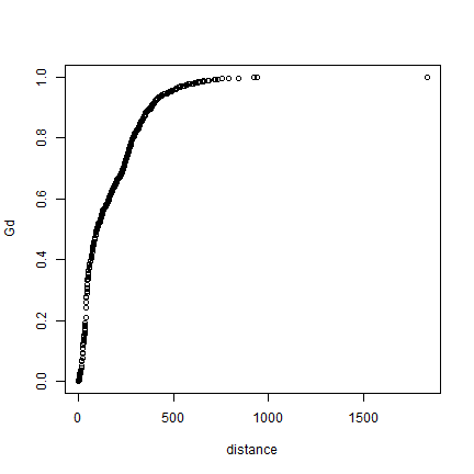
# using xlim to exclude the extremes
plot(distance, Gd, xlim=c(0,500))
Here is a function to show these values in a more standard way.
stepplot <- function(x, y, type='l', add=FALSE, ...) {
    x <- as.vector(t(cbind(x, c(x[-1], x[length(x)]))))
    y <- as.vector(t(cbind(y, y)))
  if (add) {
     lines(x,y, ...)
  } else {
       plot(x,y, type=type, ...)
  }
}
And use it for our G function data.
stepplot(distance, Gd, type='l', lwd=2, xlim=c(0,500))
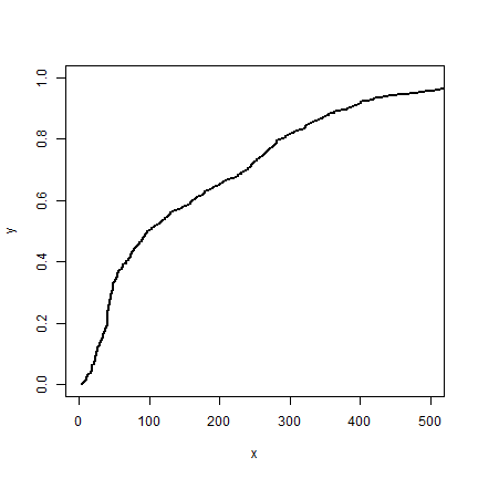
The steps are so small in our data, that you hardly see the difference.
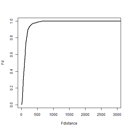
I use the centers of previously defined raster cells to compute the F function.
c# get the centers of the 'quadrats' (raster cells)
## function (...)  .Primitive("c")
p <- as.points(r)
# compute distance from all crime sites to these cell centers
d2 <- distance(p, crime)
d2 <- as.matrix(d2)
# the remainder is similar to the G function
Fdistance <- sort(unique(round(d2)))
mind <- apply(d2, 1, min)
Fd <- sapply(Fdistance, function(x) sum(mind < x))
Fd <- Fd / length(mind)
plot(Fdistance, Fd, type='l', lwd=2, xlim=c(0,3000))
Compute the expected distributon (5.12 on page 145)
ef <- function(d, lambda) {
  E <- 1 - exp(-1 * lambda * pi * d^2)
}
expected <- ef(0:2000, dens)
Now, let’s combine F and G on one plot.
plot(distance, Gd, type='l', lwd=2, col='red', las=1,
    ylab='F(d) or G(d)', xlab='Distance', yaxs="i", xaxs="i", ylim=c(0,1.1))
lines(Fdistance, Fd, lwd=2, col='blue')
lines(0:2000, expected, lwd=2)
legend(1200, .3,
   c(expression(italic("G")["d"]), expression(italic("F")["d"]), 'expected'),
   lty=1, col=c('red', 'blue', 'black'), lwd=2, bty="n")
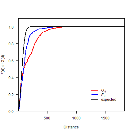
Question 3: What does this plot suggest about the point pattern?
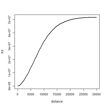
Finally, let’s compute K. Note that I use the original distance matrix ‘d’ here.
distance <- seq(1, 30000, 100)
Kd <- sapply(distance, function(x) sum(d < x)) # takes a while
Kd <- Kd / (length(Kd) * dens)
plot(distance, Kd, type='l', lwd=2)
Question 4: Create a single random pattern of events for the city, with the same number of events as the crime data (object xy). Use function ‘spsample’
Question 5: Compute the G function, and plot it on a single plot, together with the G function for the observed crime data, and the theoretical expectation (formula 5.12).
Question 6: (Difficult!) Do a Monte Carlo simulation (page 149) to see if the ‘mean nearest distance’ of the observed crime data is significantly different from a random pattern. Use a ‘for loop’. First write ‘pseudo-code’. That is, say in natural language what should happen. Then try to write R code that implements this.
Spatstat package
Above we did some ‘home-brew’ point pattern analysis, we will now use the spatstat package. In research you would normally use spatstat rather than your own functions, at least for standard analysis. I showed how you make some of these functions in the previous sections, because understanding how to go about that may allow you to take things in directions that others have not gone. The good thing about spatstat is that it very well documented (see http://spatstat.github.io/). The bad thing is that it uses an entirly different sets of classes (ways to represent spatial data) that we we will use in all other labs (classes from sp and raster); but it is not hard to get used to that.
library(spatstat)
We start with making make a Kernel Density raster. I first create a ‘ppp’ (point pattern) object, as defined in the spatstat package.
A ppp object has the coordinates of the points and the analysis ‘window’ (study region). To assign the points locations we need to extract the coordinates from our SpatialPoints object. To set the window, we first need to to coerce our SpatialPolygons into an ‘owin’ object. We need a function from the maptools package for this coercion.
Coerce from SpatVector to an object of class “owin” (observation window)
via sf
cityOwin <- as.owin(sf::st_as_sf(city))
class(cityOwin)
## [1] "owin"
cityOwin
## window: polygonal boundary
## enclosing rectangle: [6620591, 6654380] x [1956729.8, 1971518.9] units
Extract coordinates from SpatialPointsDataFrame:
pts <- terra::crds(crime)
head(pts)
##            x       y
## [1,] 6628868 1963718
## [2,] 6632796 1964362
## [3,] 6636855 1964873
## [4,] 6626493 1964343
## [5,] 6639506 1966094
## [6,] 6640478 1961983
Now we can create a ‘ppp’ (point pattern) object
p <- ppp(pts[,1], pts[,2], window=cityOwin)
## Warning: 20 points were rejected as lying outside the specified window
## Warning: data contain duplicated points
class(p)
## [1] "ppp"
p
## Planar point pattern: 2641 points
## window: polygonal boundary
## enclosing rectangle: [6620591, 6654380] x [1956729.8, 1971518.9] units
## *** 20 illegal points stored in attr(,"rejects") ***
plot(p)
## Warning in plot.ppp(p): 20 illegal points also plotted
Note the warning message about ‘illegal’ points. Do you see them and do you understand why they are illegal?
Having all the data well organized, it is now easy to compute Kernel Density
ds <- density(p)
class(ds)
## [1] "im"
plot(ds, main='crime density')
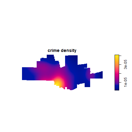
Density is the number of points per unit area. Let’s ceck if the numbers makes sense, by adding them up and mulitplying with the area of the raster cells. I use terra package functions for that.
nrow(pts)
## [1] 2661
r <- rast(ds)
s <- sum(values(r), na.rm=TRUE)
s * prod(res(r))
## [1] 2640.556
Looks about right. We can also get the information directly from the “im” (image) object
str(ds)
## List of 10
##  $ v     : num [1:128, 1:128] NA NA NA NA NA NA NA NA NA NA ...
##  $ dim   : int [1:2] 128 128
##  $ xrange: num [1:2] 6620591 6654380
##  $ yrange: num [1:2] 1956730 1971519
##  $ xstep : num 264
##  $ ystep : num 116
##  $ xcol  : num [1:128] 6620723 6620987 6621251 6621515 6621779 ...
##  $ yrow  : num [1:128] 1956788 1956903 1957019 1957134 1957250 ...
##  $ type  : chr "real"
##  $ units :List of 3
##   ..$ singular  : chr "unit"
##   ..$ plural    : chr "units"
##   ..$ multiplier: num 1
##   ..- attr(*, "class")= chr "unitname"
##  - attr(*, "class")= chr "im"
##  - attr(*, "sigma")= num 1849
##  - attr(*, "kernel")= chr "gaussian"
##  - attr(*, "kerdata")=List of 5
##   ..$ sigma   : num 1849
##   ..$ varcov  : NULL
##   ..$ cutoff  : num 14789
##   ..$ warnings: NULL
##   ..$ kernel  : chr "gaussian"
sum(ds$v, na.rm=TRUE) * ds$xstep * ds$ystep
## [1] 2640.556
p$n
## [1] 2641
Here’s another, lenghty, example of generalization. We can interpolate population density from (2000) census data; assigning the values to the centroid of a polygon (as explained in the book, but not a great technique). We use a shapefile with census data.
census <- spat_data("census2000.rds")
To compute population density for each census block, we first need to get the area of each polygon. I transform density from persons per feet2 to persons per mile2, and then compute population density from POP2000 and the area
census$area <- expanse(census)
census$area <- census$area/27878400
census$dens <- census$POP2000 / census$area
Now to get the centroids of the census blocks.
p <- terra::crds(centroids(census))
head(p)
##            x       y
## [1,] 6666671 1991720
## [2,] 6655379 1986903
## [3,] 6604777 1982474
## [4,] 6612242 1981881
## [5,] 6613488 1986776
## [6,] 6616743 1986446
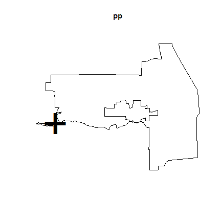
To create the ‘window’ we dissolve all polygons into a single polygon.
win <- aggregate(census)
Let’s look at what we have:
plot(census)
points(p, col='red', pch=20, cex=.25)
plot(win, add=TRUE, border='blue', lwd=3)
Now we can use ‘Smooth.ppp’ to interpolate. Population density at the points is referred to as the ‘marks’
owin <- as.owin(sf::st_as_sf(win))
pp <- ppp(p[,1], p[,2], window=owin, marks=census$dens)
## Warning: 1 point was rejected as lying outside the specified window
pp
## Marked planar point pattern: 645 points
## marks are numeric, of storage type  'double'
## window: polygonal boundary
## enclosing rectangle: [6576938, 6680926] x [1926586.1, 2007558.2] units
## *** 1 illegal point stored in attr(,"rejects") ***
Note the warning message: “1 point was rejected as lying outside the specified window”. That is odd, there is a polygon that has a centroid that is outside of the polygon. This can happen with, e.g., kidney shaped polygons.
Let’s find and remove this point that is outside the study area.
sp <- vect(p, crs=crs(win))
i <- relate(sp, win, "intersects")
i <- which(!i)
i
## [1] 588
Let’s see where it is:
plot(census)
points(sp)
points(sp[i,], col='red', cex=3, pch=20)
You can zoom in using the code below. After running the next line, click on your map twice to zoom to the red dot, otherwise you cannot continue:
zoom(census)
And add the red points again
points(sp[i,], col='red')
To only use points that intersect with the window polygon, that is, where ‘i == TRUE’:
pp <- ppp(p[i,1], p[i,2], window=owin, marks=census$dens[i])
## Warning: 1 point was rejected as lying outside the specified window
plot(pp)
## Warning in plot.ppp(pp): 1 illegal points also plotted
plot(city, add=TRUE)
And to get a smooth interpolation of population density.
s <- Smooth.ppp(pp)
plot(s)
## Warning: All pixel values are NA
## Warning: Cannot determine range of values for colour map
plot(city, add=TRUE)
Population density could establish the “population at risk” (to commit a crime) for certain crimes, but not for others.
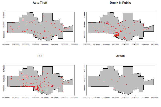
Maps with the city limits and the incidence of ‘auto-theft’, ‘drunk in public’, ‘DUI’, and ‘Arson’.
par(mfrow=c(2,2), mai=c(0.25, 0.25, 0.25, 0.25))
for (offense in c("Auto Theft", "Drunk in Public", "DUI", "Arson")) {
  plot(city, col='grey')
    acrime <- crime[crime$CATEGORY == offense, ]
    points(acrime, col = "red")
    title(offense)
}
Create a marked point pattern object (ppp) for all crimes. It is important to coerce the marks to a factor variable.
crime$fcat <- as.factor(crime$CATEGORY)
w <- as.owin(sf::st_as_sf(city))
xy <- terra::crds(crime)
mpp <- ppp(xy[,1], xy[,2], window = w, marks=as.factor(crime$fcat))
## Warning: 20 points were rejected as lying outside the specified window
## Warning: data contain duplicated points
We can split the mpp object by category (crime)
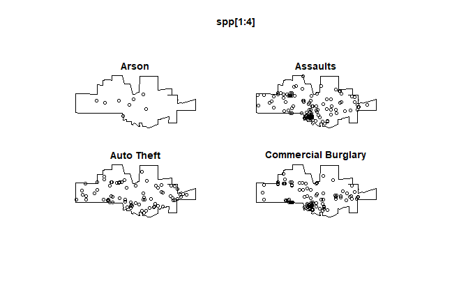
spp <- split(mpp)
plot(spp[1:4], main=)
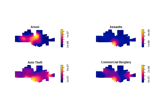
The crime density by category:
plot(density(spp[1:4]), main='')
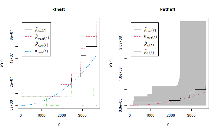
And produce K-plots (with an envelope) for ‘drunk in public’ and ‘Arson’. Can you explain what they mean?
spatstat.options(checksegments = FALSE)
ktheft <- Kest(spp$"Auto Theft")
ketheft <- envelope(spp$"Auto Theft", Kest)
## Generating 99 simulated realisations of CSR  ...
## 1, 2, 3, 4, 5, 6, 7, 8, 9, 10, 11, 12, 13, 14, 15, 16, 17, 18, 19, 20,
## 21, 22, 23, 24, 25, 26, 27, 28, 29, 30, 31, 32, 33, 34, 35, 36, 37, 38, 39, 40,
## 41, 42, 43, 44, 45, 46, 47, 48, 49, 50, 51, 52, 53, 54, 55, 56, 57, 58, 59, 60,
## 61, 62, 63, 64, 65, 66, 67, 68, 69, 70, 71, 72, 73, 74, 75, 76, 77, 78, 79, 80,
## 81, 82, 83, 84, 85, 86, 87, 88, 89, 90, 91, 92, 93, 94, 95, 96, 97, 98,
## 99.
##
## Done.
ktheft <- Kest(spp$"Arson")
ketheft <- envelope(spp$"Arson", Kest)
## Generating 99 simulated realisations of CSR  ...
## 1, 2, 3, 4, 5, 6, 7, 8, 9, 10, 11, 12, 13, 14, 15, 16, 17, 18, 19, 20,
## 21, 22, 23, 24, 25, 26, 27, 28, 29, 30, 31, 32, 33, 34, 35, 36, 37, 38, 39, 40,
## 41, 42, 43, 44, 45, 46, 47, 48, 49, 50, 51, 52, 53, 54, 55, 56, 57, 58, 59, 60,
## 61, 62, 63, 64, 65, 66, 67, 68, 69, 70, 71, 72, 73, 74, 75, 76, 77, 78, 79, 80,
## 81, 82, 83, 84, 85, 86, 87, 88, 89, 90, 91, 92, 93, 94, 95, 96, 97, 98,
## 99.
##
## Done.
par(mfrow=c(1,2))
plot(ktheft)
plot(ketheft)
Let’s try to answer the question you have been wanting to answer all along. Is population density a good predictor of being (booked for) “drunk in public” and for “Arson”? One approach is to do a Kolmogorov-Smirnov (‘kstest’) on ‘Drunk in Public’ and ‘Arson’, using population density as a covariate:
KS.arson <- cdf.test(spp$Arson, ds)
KS.arson
##
##  Spatial Kolmogorov-Smirnov test of CSR in two dimensions
##
## data:  covariate 'ds' evaluated at points of 'spp$Arson'
##      and transformed to uniform distribution under CSR
## D = 0.50594, p-value = 0.01169
## alternative hypothesis: two-sided
KS.drunk <- cdf.test(spp$'Drunk in Public', ds)
KS.drunk
##
##  Spatial Kolmogorov-Smirnov test of CSR in two dimensions
##
## data:  covariate 'ds' evaluated at points of 'spp$"Drunk in Public"'
##      and transformed to uniform distribution under CSR
## D = 0.53993, p-value < 2.2e-16
## alternative hypothesis: two-sided
Question 7: Why is the result surprising, or not surprising?
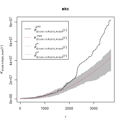
We can also compare the patterns for “drunk in public” and for “Arson” with the KCross function.
kc <- Kcross(mpp, i = "Drunk in Public", j = "Arson")
ekc <- envelope(mpp, Kcross, nsim = 50, i = "Drunk in Public", j = "Arson")
## Generating 50 simulated realisations of CSR  ...
## 1, 2, 3, 4, 5, 6, 7, 8, 9, 10, 11, 12, 13, 14, 15, 16, 17, 18, 19, 20,
## 21, 22, 23, 24, 25, 26, 27, 28, 29, 30, 31, 32, 33, 34, 35, 36, 37, 38, 39, 40,
## 41, 42, 43, 44, 45, 46, 47, 48, 49,
## 50.
##
## Done.
plot(ekc)
Much more about point pattern analysis with spatstat is available here