Scale and distance
Introduction
Scale, aggregation, and distance are two key concepts in spatial data analysis that can be difficult to come to grips with. This chapter first discusses scale and related concepts resolution, aggregation and zonation. The second part of the chapter discusses distance and adjacency.
Scale and resolution
The term “scale” is tricky. In its narrow geographic sense, it is the the ratio of a distance on a (paper) map to the actual distance. So if a distance of 1 cm on map “A” represents 100 m in the real world, the map scale is 1/10,000 (1:10,000 or 10-4). If 1 cm on map “B” represents 10 km in the real world, the scale of that map is 1/1,000,000. The first map “A” would have relatively large scale (and high resolution) as compared to the second map “B”, that would have a small scale (and low resolution). It follows that if the size maps “A” and “B” were the same, map “B” would represent a much larger area (would have a much larger “spatial extent”). For that reason, most people would refer to map “B” having a “larger scale”. That is technically wrong, but there is not much point in fighting that, and it is simply best to avoid the term “scale”, and certainly “small scale” and “large scale”, because that technically means the opposite of what most people think. If you want to use these terms, you should probably use them how they are commonly understood; unless you are among cartographers, of course.
Now that mapping has become a computer based activity, scale is even more treacherous. You can use the same data to make maps of different sizes. These would all have a different scale. With digital data, we are more interested in the “inherent” or “measurement” scale of the data. This is sometimes referred to as “grain” but I use “(spatial) resolution”. In the case of raster data the notion of resolution is straightforward: it is the size of the cells. For vector data resolution is not as well defined, and it can vary largely within a data set, but you can think of it as the average distance between the nodes (coordinate pairs) of the lines or polygons. Point data do not have a resolution, unless cases that are within a certain distance of each other are merged into a single point (the actual geographic objects represented by points, actually do cover some area; so the actual average size of those areas could also be a measure of interest, but it typically is not).
In the digital world it is easy to create a “false resolution”, either by dividing raster cells into 4 or more smaller cells, or by adding nodes in-between nodes of polygons. Imagine having polygons with soils data for a country. Let’s say that these polygons cover, on average, an area of 100 * 100 = 10,000 km2. You can transfer the soil properties associated with each polygon, e.g. pH, to a raster with 1 km2 spatial resolution; and now might (incorrectly) say that you have a 1 km2 spatial resolution soils map. So we need to distinguish the resolution of the representation (data) and the resolution of the measurements or estimates. The lowest of the two is the one that matters.
Why does scale/resolution matter?
First of all, different processes have different spatial and temporal scales at which they operate Levin, 1992 — in this context, scale refers both to “extent” and “resolution”. Processes that operate over a larger extent (e.g., a forest) can be studied at a larger resolution (trees) whereas processes that operate over a smaller extent (e.g. a tree) may need to be studied at the level of leaves.
From a practical perspective: it affects our estimates of length and size. For example if you wanted to know the length of the coastline of Britain, you could use the length of spatial dataset representing that coastline. You could get rather different numbers depending on the data set used. The higher the resolution of the spatial data, the longer the coastline would appear to be. This is not just a problem of the representation (the data), also at a theoretical level, one can argue that the length of the coastline is not defined, as it becomes infinite if your resolution approaches zero. This is illustrated here
Resolution also affects our understanding of relationships between variables of interest. In terms of data collection this means that we want data to be at the highest spatial (and temporal) resolution possible (affordable). We can aggregate our data to lower resolutions, but it is not nearly as easy, or even impossible to correctly disaggregate (“downscale”) data to a higher resolution.
Zonation
Geographic data are often aggregated by zones. While we would like to have data at the most granular level that is possible or meanigful (individuals, households, plots, sites), reality is that we often can only get data that is aggregated. Rather than having data for individuals, we may have mean values for all inhabitants of a census district. Data on population, disease, income, or crop yield, is typically available for entire countries, for a number of sub-national units (e.g. provinces), or a set of raster cells.
The areas used to aggregate data are arbitrary (at least relative to the data of interest). The way the borders of the areas are drawn (how large, what shape, where) can strongly affect the patterns we see and the outcome of data analysis. This is sometimes referred to as the “Modifiable Areal Unit Problem” (MAUP). The problem of analyzing aggregated data is referred to as “Ecological Inference”.
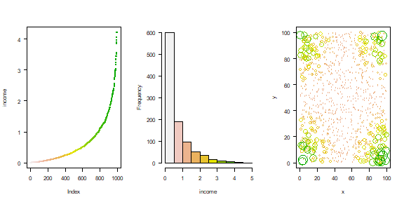
To illustrate the effect of zonation and aggregation, I create a region with 1000 households. For each household we know where they live and what their annual income is. I then aggregate the data to a set of zones.
The income distribution data
set.seed(0)
xy <- cbind(x=runif(1000, 0, 100), y=runif(1000, 0, 100))
income <- (runif(1000) * abs((xy[,1] - 50) * (xy[,2] - 50))) / 500
Inspect the data, both spatially and non-spatially. The first two plots show that there are many poor people and a few rich people. The third that there is a clear spatial pattern in where the rich and the poor live.
par(mfrow=c(1,3), las=1)
plot(sort(income), col=rev(terrain.colors(1000)), pch=20, cex=.75, ylab='income')
hist(income, main='', col=rev(terrain.colors(10)),  xlim=c(0,5), breaks=seq(0,5,0.5))
plot(xy, xlim=c(0,100), ylim=c(0,100), cex=income, col=rev(terrain.colors(50))[10*(income+1)])
Income inequality is often expressed with the Gini coefficient.
n <- length(income)
G <- (2 * sum(sort(income) * 1:n)/sum(income) - (n + 1)) / n
G
## [1] 0.5814548
For our data set the Gini coefficient is 0.581.
Now assume that the household data was grouped by some kind of census districts. I create different districts, in our case rectangular raster cells, and compute mean income for each district.
library(terra)
## terra 1.9.21
v <- vect(xy)
v$income <- income
r1 <- rast(ncol=1, nrow=4, xmin=0, xmax=100, ymin=0, ymax=100)
r1 <- rasterize(v, r1, "income", mean)
r2 <- rast(ncol=4, nrow=1, xmin=0, xmax=100, ymin=0, ymax=100)
r2 <- rasterize(v, r2, "income", mean)
r3 <- rast(ncol=2, nrow=2, xmin=0, xmax=100, ymin=0, ymax=100)
r3 <- rasterize(v, r3, "income", mean)
r4 <- rast(ncol=3, nrow=3, xmin=0, xmax=100, ymin=0, ymax=100)
r4 <- rasterize(v, r4, "income", mean)
r5 <- rast(ncol=5, nrow=5, xmin=0, xmax=100, ymin=0, ymax=100)
r5 <- rasterize(v, r5, "income", mean)
r6 <- rast(ncol=10, nrow=10, xmin=0, xmax=100, ymin=0, ymax=100)
r6 <- rasterize(v, r6, "income", mean)
Have a look at the plots of the income distribution and the sub-regional averages.
par(mfrow=c(2,3), las=1)
plot(r1); plot(r2); plot(r3); plot(r4); plot(r5); plot(r6)
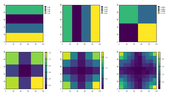
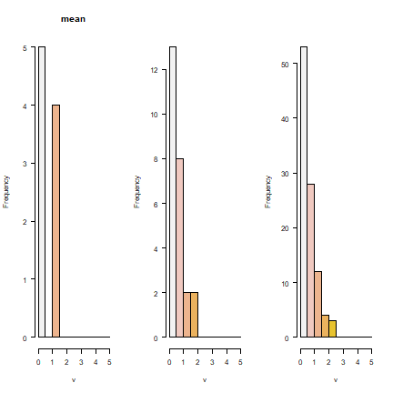
It is not surprising to see that the smaller the regions get, the better the real pattern is captured. But in all cases, the histograms show that we do not capture the full income distribution (compare to the histogram with the data for individuals).
par(mfrow=c(1,3), las=1)
hist(r4, col=rev(terrain.colors(10)), xlim=c(0,5), breaks=seq(0, 5, 0.5))
hist(r5, main="", col=rev(terrain.colors(10)), xlim=c(0,5), breaks=seq(0, 5, 0.5))
hist(r6, main="", col=rev(terrain.colors(10)), xlim=c(0,5), breaks=seq(0, 5, 0.5))
Distance
Distance is a numerical description of how far apart things are. It is the most fundamental concept in geography. After all, Waldo Tobler’s First Law of Geography states that “everything is related to everything else, but near things are more related than distant things”. But how far away are things? That is not always as easy a question as it seems. Of course we can compute distance “as the crow flies” but that is often not relevant. Perhaps you need to also consider national borders, mountains, or other barriers. The distance between A and B may even by asymetric, meaning that it the distance from A to B is not the same as from B to A (for example, the President of the United States can call me, but I cannot call him (or her)); or because you go faster when walking downhill than when waling uphill.
Distance matrix
Distances are often described in a “distance matrix”. In a distance matrix we have a number for the distance between all objects of interest. If the distance is symmetric, we only need to fill half the matrix.
Let’s create a distance matrix from a set of points. We start with a set of points
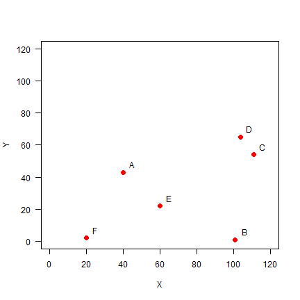
Set up the data, using x-y coordinates for each point:
A <- c(40, 43)
B <- c(101, 1)
C <- c(111, 54)
D <- c(104, 65)
E <- c(60, 22)
F <- c(20, 2)
pts <- rbind(A, B, C, D, E, F)
pts
##   [,1] [,2]
## A   40   43
## B  101    1
## C  111   54
## D  104   65
## E   60   22
## F   20    2
Plot the points and labels:
plot(pts, xlim=c(0,120), ylim=c(0,120), pch=20, cex=2, col='red', xlab='X', ylab='Y', las=1)
text(pts+5, LETTERS[1:6])
You can use the dist function to make a distance matrix with a data
set of any dimension.
dis <- dist(pts)
dis
##           A         B         C         D         E
## B  74.06079
## C  71.84706  53.93515
## D  67.67570  64.07027  13.03840
## E  29.00000  46.06517  60.20797  61.52235
## F  45.61798  81.00617 104.80935 105.00000  44.72136
We can check that for the first point using Pythagoras’ theorem.
sqrt((40-101)^2 + (43-1)^2)
## [1] 74.06079
We can transform a distance matrix into a normal matrix.
D <- as.matrix(dis)
round(D)
##    A  B   C   D  E   F
## A  0 74  72  68 29  46
## B 74  0  54  64 46  81
## C 72 54   0  13 60 105
## D 68 64  13   0 62 105
## E 29 46  60  62  0  45
## F 46 81 105 105 45   0
Distance matrices are used in all kinds of non-geographical applications. For example, they are often used to create cluster diagrams (dendograms).
Question 4: Show R code to make a cluster dendogram summarizing the
distances between these six sites, and plot it. See ?hclust.
Distance for longitude/latitude coordinates
Now consider that the values in pts were coordinates in degrees
(longitude/latitude). Then the cartesian distance as computed by the
dist function would be incorrect. In that case we can use the
pointDistance function from the raster package.
gdis <- distance(pts, lonlat=TRUE)
gdis
##         1       2       3       4       5
## 2 7614198
## 3 5155577 5946748
## 4 4581656 7104895 1286094
## 5 2976166 5011592 5536367 5737063
## 6 4957298 9013726 9894640 9521864 4859627
Question 5: What is the unit of the values in ``gdis``?
Spatial influence
An important step in spatial statistics and modelling is to get a measure of the spatial influence between geographic objects. This can be expressed as a function of adjacency or (inverse) distance, and is often expressed as a spatial weights matrix. Influence is of course very complex and cannot really be measured and it can be estimated in many ways. For example the influence between a set of polyongs (countries) can be expressed as having a shared border or not (being ajacent); as the “crow-fly” distance between their centroids;or as the lengths of a shared border, and in other ways.
Adjacency
Adjacency is an important concept in some spatial analysis. In some cases objects are considered ajacent when they “touch”, e.g. neighboring countries. In can also be based on distance. This is the most common approach when analyzing point data.
We create an adjacency matrix for the point data analysed above. We
define points as “ajacent” if they are within a distance of 50 from each
other. Given that we have the distance matrix D this is easy to do.
a <-  D < 50
a
##       A     B     C     D     E     F
## A  TRUE FALSE FALSE FALSE  TRUE  TRUE
## B FALSE  TRUE FALSE FALSE  TRUE FALSE
## C FALSE FALSE  TRUE  TRUE FALSE FALSE
## D FALSE FALSE  TRUE  TRUE FALSE FALSE
## E  TRUE  TRUE FALSE FALSE  TRUE  TRUE
## F  TRUE FALSE FALSE FALSE  TRUE  TRUE
In adjacency matrices the diagonal values are often set to NA (we do
not consider a point to be adjacent to itself). And TRUE/FALSE
values are commonly stored as 1/0 (this is equivalent, and we can
make this change with a simple trick: multiplication with 1)
diag(a) <- NA
Adj50 <- a * 1
Adj50
##    A  B  C  D  E  F
## A NA  0  0  0  1  1
## B  0 NA  0  0  1  0
## C  0  0 NA  1  0  0
## D  0  0  1 NA  0  0
## E  1  1  0  0 NA  1
## F  1  0  0  0  1 NA
Two nearest neighbours
What if you wanted to compute the “two nearest neighbours” (or three, or four) adjacency-matrix? Here is how you can do that. For each row, we first get the column numbers in order of the values in that row (that is, the numbers indicate how the values are ordered).
cols <- apply(D, 1, order)
# we need to transpose the result
cols <- t(cols)
And then get columns 2 to 3 (why not column 1?)
cols <- cols[, 2:3]
cols
##   [,1] [,2]
## A    5    6
## B    5    3
## C    4    2
## D    3    5
## E    1    6
## F    5    1
As we now have the column numbers, we can make the row-column pairs that
we want (rowcols).
rowcols <- cbind(rep(1:6, each=2), as.vector(t(cols)))
head(rowcols)
##      [,1] [,2]
## [1,]    1    5
## [2,]    1    6
## [3,]    2    5
## [4,]    2    3
## [5,]    3    4
## [6,]    3    2
We use these pairs as indices to change the values in matrix Ak3.
Ak3 <- Adj50 * 0
Ak3[rowcols] <- 1
Ak3
##    A  B  C  D  E  F
## A NA  0  0  0  1  1
## B  0 NA  1  0  1  0
## C  0  1 NA  1  0  0
## D  0  0  1 NA  1  0
## E  1  0  0  0 NA  1
## F  1  0  0  0  1 NA
Weights matrix
Rather than expressing spatial influence as a binary value (adjacent or not), it is often expressed as a continuous value. The simplest approach is to use inverse distance (the further away, the lower the value).
W <- 1 / D
round(W, 4)
##        A      B      C      D      E      F
## A    Inf 0.0135 0.0139 0.0148 0.0345 0.0219
## B 0.0135    Inf 0.0185 0.0156 0.0217 0.0123
## C 0.0139 0.0185    Inf 0.0767 0.0166 0.0095
## D 0.0148 0.0156 0.0767    Inf 0.0163 0.0095
## E 0.0345 0.0217 0.0166 0.0163    Inf 0.0224
## F 0.0219 0.0123 0.0095 0.0095 0.0224    Inf
Such as “spatial weights” matrix is often “row-normalized”, such that
the sum of weights for each row in the matrix is the same. First we get
rid if the Inf values by changing them to NA. (Where did the
Inf values come from?)
W[!is.finite(W)] <- NA
Then compute the row sums.
rtot <- rowSums(W, na.rm=TRUE)
# this is equivalent to
# rtot <- apply(W, 1, sum, na.rm=TRUE)
rtot
##          A          B          C          D          E          F
## 0.09860117 0.08170418 0.13530597 0.13285878 0.11141516 0.07569154
And divide the rows by their totals and check if they row sums add up to 1.
W <- W / rtot
rowSums(W, na.rm=TRUE)
## A B C D E F
## 1 1 1 1 1 1
The values in the columns do not add up to 1.
colSums(W, na.rm=TRUE)
##         A         B         C         D         E         F
## 0.9784548 0.7493803 1.2204900 1.1794393 1.1559273 0.7163082
Spatial influence for polygons
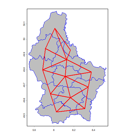
Above we looked at adjacency for a set of points. Here we look at it for polygons. The difference is that
p <- vect(system.file("ex/lux.shp", package="terra"))
We create a “rook’s case” neighbors matrix.
wr <- adjacent(p, "rook", pairs=FALSE)
dim(wr)
## [1] 12 12
wr[1:6,1:11]
##   1 2 3 4 5 6 7 8 9 10 11
## 1 0 1 0 1 1 0 0 0 0  0  0
## 2 1 0 1 1 1 1 0 0 0  0  0
## 3 0 1 0 0 1 0 0 0 1  0  0
## 4 1 1 0 0 0 0 0 0 0  0  0
## 5 1 1 1 0 0 0 0 0 0  0  0
## 6 0 1 0 0 0 0 0 1 0  0  0
Compute the number of neighbors for each area.
i <- rowSums(wr)
i
##  1  2  3  4  5  6  7  8  9 10 11 12
##  3  6  4  2  3  3  3  4  4  3  5  6
Expresses as percentage
round(100 * table(i) / length(i), 1)
## i
##    2    3    4    5    6
##  8.3 41.7 25.0  8.3 16.7
Plot the links between the polygons.
par(mai=c(0,0,0,0))
plot(p, col="gray", border="blue")
nb <- adjacent(p, "rook")
v <- centroids(p)
p1 <- v[nb[,1], ]
p2 <- v[nb[,2], ]
lines(p1, p2, col="red", lwd=2)
Now some alternative approaches to compute “spatial influence”.
Distance based:
wd10 <- nearby(v, distance=10000)
wd25 <- nearby(v, distance=25000)
Nearest neighbors:
k3 <- nearby(v, k=3)
k6 <- nearby(v, k=6)
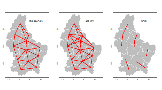
And now we plot some using the plotit function.
plotit <- function(nb, lab='') {
  plot(p, col='gray', border='white')
  v <- centroids(p)
  p1 <- v[nb[,1], ,drop=FALSE]
  p2 <- v[nb[,2], ,drop=FALSE]
  lines(p1, p2, col="red", lwd=2)
  text(6.3, 50.1, paste0('(', lab, ')'), cex=1.25)
}
par(mfrow=c(1, 3), mai=c(0,0,0,0))
plotit(nb, "adjacency")
plotit(wd25, "25 km")
plotit(k3, "k=3")