Interpolation
Introduction
Almost any geographic variable of interest has spatial autocorrelation. That can be a problem in statistical tests, but it is a very useful feature when we want to predict values at locations where no measurements have been made; as we can generally safely assume that values at nearby locations will be similar. There are several spatial interpolation techniques. We show some of them in this chapter.
Temperature in California
We will be working with temperature data for California, USA. If have
not yet done so, first install the rspat package to get the data.
You may need to install the remotes package first.
if (!require("rspat")) remotes::install_github('rspatial/rspat')
## Loading required package: rspat
## Loading required package: terra
## terra 1.9.21
Now get the data:
library(rspat)
d <- spat_data('precipitation')
head(d)
##      ID                 NAME   LAT    LONG ALT  JAN FEB MAR APR MAY JUN JUL
## 1 ID741         DEATH VALLEY 36.47 -116.87 -59  7.4 9.5 7.5 3.4 1.7 1.0 3.7
## 2 ID743  THERMAL/FAA AIRPORT 33.63 -116.17 -34  9.2 6.9 7.9 1.8 1.6 0.4 1.9
## 3 ID744          BRAWLEY 2SW 32.96 -115.55 -31 11.3 8.3 7.6 2.0 0.8 0.1 1.9
## 4 ID753 IMPERIAL/FAA AIRPORT 32.83 -115.57 -18 10.6 7.0 6.1 2.5 0.2 0.0 2.4
## 5 ID754               NILAND 33.28 -115.51 -18  9.0 8.0 9.0 3.0 0.0 1.0 8.0
## 6 ID758        EL CENTRO/NAF 32.82 -115.67 -13  9.8 1.6 3.7 3.0 0.4 0.0 3.0
##    AUG SEP OCT NOV DEC
## 1  2.8 4.3 2.2 4.7 3.9
## 2  3.4 5.3 2.0 6.3 5.5
## 3  9.2 6.5 5.0 4.8 9.7
## 4  2.6 8.3 5.4 7.7 7.3
## 5  9.0 7.0 8.0 7.0 9.0
## 6 10.8 0.2 0.0 3.3 1.4
Compute annual precipitation
mnts <- toupper(month.abb)
d$prec <- rowSums(d[, mnts])
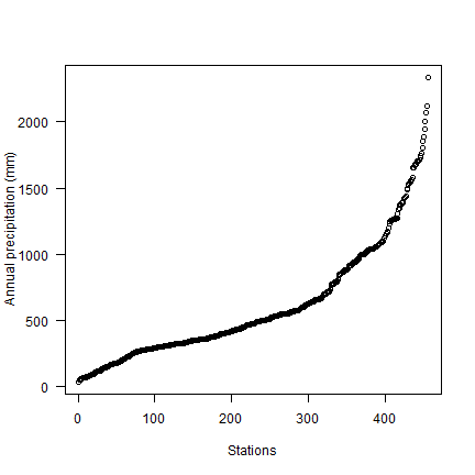
plot(sort(d$prec), ylab="Annual precipitation (mm)", las=1, xlab="Stations")
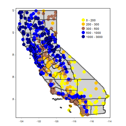
Now make a quick map.
dsp <- vect(d, c("LONG", "LAT"), crs="+proj=longlat +datum=NAD83")
CA <- spat_data("counties")
# define groups for mapping
cuts <- c(0,200,300,500,1000,3000)
# set up a palette of interpolated colors
blues <- colorRampPalette(c('yellow', 'orange', 'blue', 'dark blue'))
plot(CA, col="light gray", lwd=4, border="dark gray")
plot(dsp, "prec", type="interval", col=blues(10), legend=TRUE, cex=2,
    breaks=cuts, add=TRUE, plg=list(x=-117.27, y=41.54))
lines(CA)
Transform longitude/latitude to planar coordinates, using the commonly used coordinate reference system for California (“Teale Albers”) to assure that our interpolation results will align with other data sets we have.
TA <- "+proj=aea +lat_1=34 +lat_2=40.5 +lat_0=0 +lon_0=-120 +x_0=0 +y_0=-4000000 +datum=WGS84 +units=m"
dta <- project(dsp, TA)
cata <- project(CA, TA)
9.2 NULL model
We are going to interpolate (estimate for unsampled locations) the precipitation values. The simplest way would be to take the mean of all observations. We can consider that a “Null-model” that we can compare other approaches to. We’ll use the Root Mean Square Error (RMSE) as evaluation statistic.
RMSE <- function(observed, predicted) {
  sqrt(mean((predicted - observed)^2, na.rm=TRUE))
}
Get the RMSE for the Null-model
null <- RMSE(mean(dsp$prec), dsp$prec)
null
## [1] 435.3217
So 435 is our target. Can we do better (have a smaller RMSE)?
proximity polygons
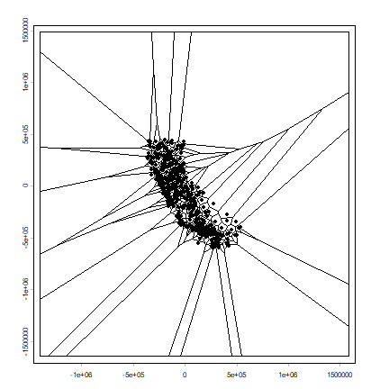
Proximity polygons can be used to interpolate categorical variables. Another term for this is “nearest neighbour” interpolation.
v <- voronoi(dta)
plot(v)
points(dta)
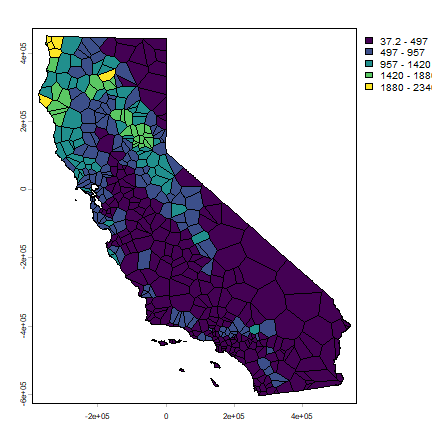
Let’s cut out what is not California, and map precipitation.
vca <- crop(v, cata)
plot(vca, "prec")
Now we can rasterize the results like this.
r <- rast(vca, res=10000)
vr <- rasterize(vca, r, "prec")
plot(vr)
And use 5-fold cross-validation to evaluate this model.
set.seed(5132015)
kf <- sample(1:5, nrow(dta), replace=TRUE)
rmse <- rep(NA, 5)
for (k in 1:5) {
  test <- dta[kf == k, ]
  train <- dta[kf != k, ]
  v <- voronoi(train)
  p <- extract(v, test)
  rmse[k] <- RMSE(test$prec, p$prec)
}
rmse
## [1] 192.0568 203.1304 183.5556 177.5523 205.6921
mean(rmse)
## [1] 192.3974
# relative model performance
perf <- 1 - (mean(rmse) / null)
round(perf, 3)
## [1] 0.558
Question 1: Describe what each step in the code chunk above does (that is, how does cross-validation work?)
Question 2: How does the proximity-polygon approach compare to the NULL model?
Question 3: You would not typically use proximty polygons for rainfall data. For what kind of data might you use them?
Nearest neighbour interpolation
Here we do nearest neighbour interpolation considering multiple (5) neighbours.
We can use the gstat package for this. First we fit a model. ~1
means “intercept only”. In the case of spatial data, that would be only
‘x’ and ‘y’ coordinates are used. We set the maximum number of points to
5, and the “inverse distance power” idp to zero, such that all five
neighbors are equally weighted
library(gstat)
d <- data.frame(geom(dta)[,c("x", "y")], as.data.frame(dta))
head(d)
##          x         y    ID                 NAME ALT  JAN FEB MAR APR MAY JUN
## 1 280058.6 -167265.5 ID741         DEATH VALLEY -59  7.4 9.5 7.5 3.4 1.7 1.0
## 2 355394.7 -480020.3 ID743  THERMAL/FAA AIRPORT -34  9.2 6.9 7.9 1.8 1.6 0.4
## 3 416370.9 -551681.2 ID744          BRAWLEY 2SW -31 11.3 8.3 7.6 2.0 0.8 0.1
## 4 415173.4 -566152.9 ID753 IMPERIAL/FAA AIRPORT -18 10.6 7.0 6.1 2.5 0.2 0.0
## 5 418432.1 -516087.7 ID754               NILAND -18  9.0 8.0 9.0 3.0 0.0 1.0
## 6 405858.6 -567692.3 ID758        EL CENTRO/NAF -13  9.8 1.6 3.7 3.0 0.4 0.0
##   JUL  AUG SEP OCT NOV DEC prec
## 1 3.7  2.8 4.3 2.2 4.7 3.9 52.1
## 2 1.9  3.4 5.3 2.0 6.3 5.5 52.2
## 3 1.9  9.2 6.5 5.0 4.8 9.7 67.2
## 4 2.4  2.6 8.3 5.4 7.7 7.3 60.1
## 5 8.0  9.0 7.0 8.0 7.0 9.0 78.0
## 6 3.0 10.8 0.2 0.0 3.3 1.4 37.2
gs <- gstat(formula=prec~1, locations=~x+y, data=d, nmax=5, set=list(idp = 0))
nn <- interpolate(r, gs, debug.level=0)
nnmsk <- mask(nn, vr)
plot(nnmsk, 1)
Again we cross-validate the result. Note that we can use the predict
method to get predictions for the locations of the test points.
rmsenn <- rep(NA, 5)
for (k in 1:5) {
  test <- d[kf == k, ]
  train <- d[kf != k, ]
  gscv <- gstat(formula=prec~1, locations=~x+y, data=train, nmax=5, set=list(idp = 0))
  p <- predict(gscv, test, debug.level=0)$var1.pred
  rmsenn[k] <- RMSE(test$prec, p)
}
rmsenn
## [1] 215.0993 209.5838 197.0604 177.1946 189.8130
mean(rmsenn)
## [1] 197.7502
1 - (mean(rmsenn) / null)
## [1] 0.5457377
Inverse distance weighted
A more commonly used method is “inverse distance weighted” interpolation. The only difference with the nearest neighbour approach is that points that are further away get less weight in predicting a value a location.
library(gstat)
gs <- gstat(formula=prec~1, locations=~x+y, data=d)
idw <- interpolate(r, gs, debug.level=0)
idwr <- mask(idw, vr)
plot(idwr, 1)
Question 4: IDW generated rasters tend to have a noticeable artefact. What is that and what causes that?
Cross-validate again. We can use predict for the locations of the
test points
rmse <- rep(NA, 5)
for (k in 1:5) {
  test <- d[kf == k, ]
  train <- d[kf != k, ]
  gs <- gstat(formula=prec~1, locations=~x+y, data=train)
  p <- predict(gs, test, debug.level=0)
  rmse[k] <- RMSE(test$prec, p$var1.pred)
}
rmse
## [1] 243.3256 212.6271 206.8982 180.1827 207.5791
mean(rmse)
## [1] 210.1225
1 - (mean(rmse) / null)
## [1] 0.5173166
Question 5: Inspect the arguments used for and make a map of the IDW model below. What other name could you give to this method (IDW with these parameters)? Why? Illustrate with a map
gs2 <- gstat(formula=prec~1, locations=~x+y, data=d, nmax=1, set=list(idp=1))
Calfornia Air Pollution data
We use California Air Pollution data to illustrate geostatistcal (Kriging) interpolation.
Data preparation
We use the airqual dataset to interpolate ozone levels for California
(averages for 1980-2009). Use the variable OZDLYAV (unit is parts
per billion). Original data
source.
Read the data file. To get easier numbers to read, I multiply OZDLYAV with 1000
x <- rspat::spat_data("airqual")
x$OZDLYAV <- x$OZDLYAV * 1000
x <- vect(x, c("LONGITUDE", "LATITUDE"), crs="+proj=longlat +datum=WGS84")
Create a SpatVector and transform to Teale Albers. Note the
units=km, which was needed to fit the variogram.
TAkm <- "+proj=aea +lat_1=34 +lat_2=40.5 +lat_0=0 +lon_0=-120 +x_0=0 +y_0=-4000000 +datum=WGS84 +units=km"
aq <- project(x, TAkm)
Create an template SpatRaster to interpolate to.
ca <- project(CA, TAkm)
r <- rast(ca)
res(r) <- 10  # 10 km if your CRS's units are in km
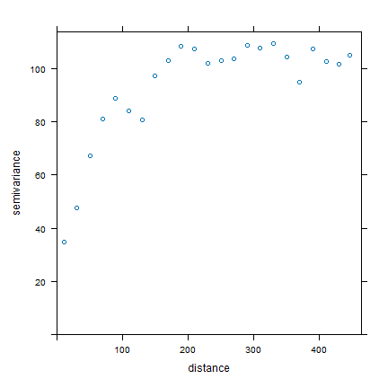
Fit a variogram
Use gstat to create an emperical variogram ‘v’
p <- data.frame(geom(aq)[, c("x", "y")], as.data.frame(aq))
gs <- gstat(formula=OZDLYAV~1, locations=~x+y, data=p)
v <- variogram(gs, width=20)
v
##      np      dist     gamma dir.hor dir.ver   id
## 1  1010  11.35040  34.80579       0       0 var1
## 2  1806  30.63737  47.52591       0       0 var1
## 3  2355  50.58656  67.26548       0       0 var1
## 4  2619  70.10411  80.92707       0       0 var1
## 5  2967  90.13917  88.93653       0       0 var1
## 6  3437 110.42302  84.13589       0       0 var1
## 7  3581 130.07080  80.59402       0       0 var1
## 8  3808 149.75625  97.06451       0       0 var1
## 9  3589 170.13526 102.97593       0       0 var1
## 10 3569 189.70054 108.28135       0       0 var1
## 11 3489 210.01413 107.48915       0       0 var1
## 12 3583 230.17040 101.95520       0       0 var1
## 13 3529 250.22845 103.06846       0       0 var1
## 14 3394 269.58370 103.63122       0       0 var1
## 15 3267 290.04602 108.81122       0       0 var1
## 16 3046 309.73363 107.58961       0       0 var1
## 17 2824 329.92996 109.52365       0       0 var1
## 18 2860 349.91455 104.27218       0       0 var1
## 19 2641 369.71992  94.76248       0       0 var1
## 20 2430 389.97879 107.47451       0       0 var1
## 21 2570 409.87266 102.55504       0       0 var1
## 22 2385 429.90866 101.55894       0       0 var1
## 23 1584 446.54929 105.00524       0       0 var1
plot(v)
Now, fit a model variogram
fve <- fit.variogram(v, vgm(85, "Exp", 75, 20))
fve
## model psill range
## 1 Nug 21.96600 0.00000
## 2 Exp 85.52957 72.31404
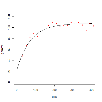
plot(variogramLine(fve, 400), type='l', ylim=c(0,120))
points(v[,2:3], pch=20, col='red')
Try a different type (spherical in stead of exponential)
fvs <- fit.variogram(v, vgm(85, "Sph", 75, 20))
fvs
##   model    psill    range
## 1   Nug 25.57019   0.0000
## 2   Sph 72.65881 135.7744
plot(variogramLine(fvs, 400), type='l', ylim=c(0,120) ,col='blue', lwd=2)
points(v[,2:3], pch=20, col='red')
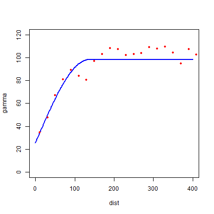
Both look pretty good in this case.
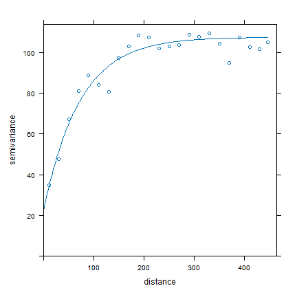
Another way to plot the variogram and the model
plot(v, fve)
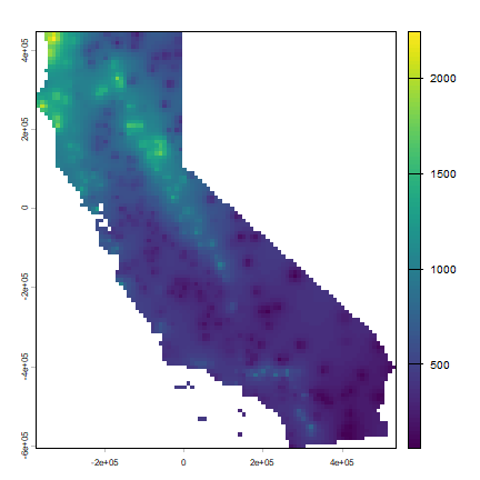
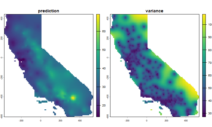
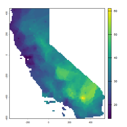
Ordinary kriging
Use variogram fve in a kriging interpolation
k <- gstat(formula=OZDLYAV~1, locations=~x+y, data=p, model=fve)
# predicted values
kp <- interpolate(r, k, debug.level=0)
ok <- mask(kp, ca)
names(ok) <- c('prediction', 'variance')
plot(ok)
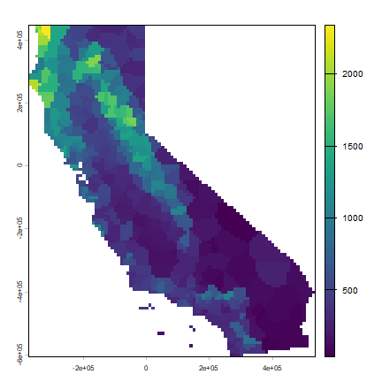
Compare with other methods
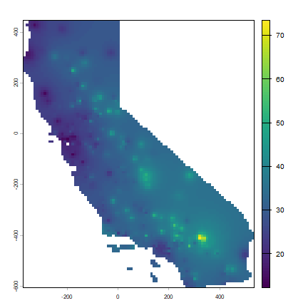
Let’s use gstat again to do IDW interpolation. The basic approach first.
idm <- gstat(formula=OZDLYAV~1, locations=~x+y, data=p)
idp <- interpolate(r, idm, debug.level=0)
idp <- mask(idp, ca)
plot(idp, 1)
We can find good values for the idw parameters (distance decay and
number of neighbours) through optimization. For simplicity’s sake I only
do that once here, not k times. The optim function may be a bit
hard to grasp at first. But the essence is simple. You provide a
function that returns a value that you want to minimize (or maximize)
given a number of unknown parameters. You also need to provide initial
values for these parameters. optim then searches for the optimal
values (for which the function returns the lowest number).
f1 <- function(x, test, train) {
  nmx <- x[1]
  idp <- x[2]
  if (nmx < 1) return(Inf)
  if (idp < .001) return(Inf)
  m <- gstat(formula=OZDLYAV~1, locations=~x+y, data=train, nmax=nmx, set=list(idp=idp))
  p <- predict(m, newdata=test, debug.level=0)$var1.pred
  RMSE(test$OZDLYAV, p)
}
set.seed(20150518)
i <- sample(nrow(aq), 0.2 * nrow(aq))
tst <- p[i,]
trn <- p[-i,]
opt <- optim(c(8, .5), f1, test=tst, train=trn)
str(opt)
## List of 5
##  $ par        : num [1:2] 9.259 0.682
##  $ value      : num 7.86
##  $ counts     : Named int [1:2] 35 NA
##   ..- attr(*, "names")= chr [1:2] "function" "gradient"
##  $ convergence: int 0
##  $ message    : NULL
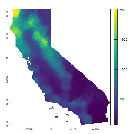
Our optimal IDW model
m <- gstat(formula=OZDLYAV~1, locations=~x+y, data=p, nmax=opt$par[1], set=list(idp=opt$par[2]))
idw <- interpolate(r, m, debug.level=0)
idw <- mask(idw, ca)
plot(idw, 1)
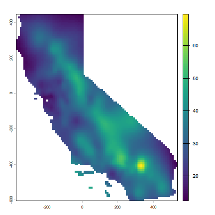
And now, for something completely different, a thin plate spline model:
library(fields)
m <- fields::Tps(p[,c("x", "y")], p$OZDLYAV)
tps <- interpolate(r, m)
tps <- mask(tps, idw[[1]])
plot(tps)
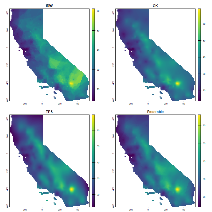
Cross-validation
Cross-validate the three methods (IDW, Ordinary kriging, TPS) and add RMSE weighted ensemble model.
k <- sample(5, nrow(p), replace=TRUE)
ensrmse <- tpsrmse <- krigrmse <- idwrmse <- rep(NA, 5)
for (i in 1:5) {
  test <- p[k!=i,]
  train <- p[k==i,]
  m <- gstat(formula=OZDLYAV~1, locations=~x+y, data=train, nmax=opt$par[1], set=list(idp=opt$par[2]))
  p1 <- predict(m, newdata=test, debug.level=0)$var1.pred
  idwrmse[i] <-  RMSE(test$OZDLYAV, p1)
  m <- gstat(formula=OZDLYAV~1, locations=~x+y, data=train, model=fve)
  p2 <- predict(m, newdata=test, debug.level=0)$var1.pred
  krigrmse[i] <-  RMSE(test$OZDLYAV, p2)
  m <- Tps(train[,c("x", "y")], train$OZDLYAV)
  p3 <- predict(m, test[,c("x", "y")])
  tpsrmse[i] <-  RMSE(test$OZDLYAV, p3)
  w <- c(idwrmse[i], krigrmse[i], tpsrmse[i])
  weights <- w / sum(w)
  ensemble <- p1 * weights[1] + p2 * weights[2] + p3 * weights[3]
  ensrmse[i] <-  RMSE(test$OZDLYAV, ensemble)
}
## Warning:
## Grid searches over lambda (nugget and sill variances) with  minima at the endpoints:
##   (GCV) Generalized Cross-Validation
##    minimum at  right endpoint  lambda  =  1.582376e-07 (eff. df= 89.30001 )
rmi <- mean(idwrmse)
rmk <- mean(krigrmse)
rmt <- mean(tpsrmse)
rms <- c(rmi, rmt, rmk)
rms
## [1] 8.011006 9.120307 7.736301
rme <- mean(ensrmse)
rme
## [1] 7.936466
Question 6: Which method performed best?
We can use the RMSE values to make a weighted ensemble. I use the normalized difference between a model’s RMSE and the NULL model as weights.
nullrmse <- RMSE(test$OZDLYAV, mean(test$OZDLYAV))
w <- nullrmse - rms
# normalize weights to sum to 1
weights <- ( w / sum(w) )
# check
sum(weights)
## [1] 1
s <- c(idw[[1]], ok[[1]], tps)
ensemble <- sum(s * weights)
And compare maps.
s <- c(idw[[1]], ok[[1]], tps, ensemble)
names(s) <- c("IDW", "OK", "TPS", "Ensemble")
plot(s)
Question 7: Show where the largest difference exist between IDW and OK.
Question 8: Show the 95% confidence interval of the OK prediction.