Graphics
With R you can make beautiful plots. You have a lot of control over what you want your plots to look like. But all the control is via code, and this does make things pretty complicated at times.
Moreover, there are entirely different approaches to make plots. Here we
only discuss scatter-plots with the “base” package. The next chapter
shows other basic plot types. The chapter thereafter shows how you can
make plots with additional packages levelplot and ggplot. It is
very useful to learn about “base” plotting first before you get into the
more complicated (and sometimes, but not always more fancy) approaches.
There are many websites with cool
examples.
Here we use the cars, InsectSprays and iris data sets that
come with R.
cars has two variables: the speed of cars and the distances taken to
stop (data recorded in the 1920s), see ?cars
Scatter plots
data(cars)
head(cars)
##   speed dist
## 1     4    2
## 2     4   10
## 3     7    4
## 4     7   22
## 5     8   16
## 6     9   10
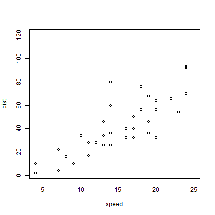
As we only have two variables, we can simply do
plot(cars)
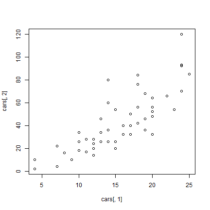
But to be more explicit:
plot(cars[,1], cars[,2])
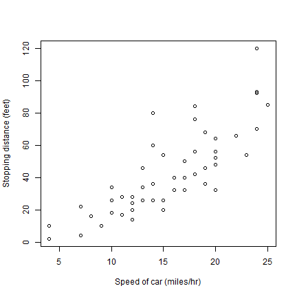
And now to embellish, add axes labels.
plot(cars[,1], cars[,2], xlab='Speed of car (miles/hr)', ylab='Stopping distance (feet)')
Different symbols (pch is the symbol type, cex is the size).
plot(cars, xlab='Speed of car (miles/hr)', ylab='Stopping distances (feet)', pch=20, cex=2, col='red')
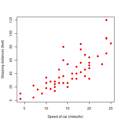
cex is the magnification factor. The default value is 1.
Let’s change some things about the axes. Use xlim and ylim to
set the start and end of an axis. las=1 changes the orientation of
the y-axis labels to horizontal.
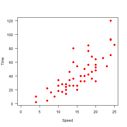
plot(cars, xlab='Speed', ylab='Time', pch=20, cex=2, col='red', xlim = c(0,25), las=1)
Here we do not draw axes at first, and then add the lower (1) and left
(2) axis, to avoid drawing the clutter from the unnecessary “upper” and
“right” axis. Arguments xaxs="i" and yaxs="i" force the axis to
touch at (0,0).
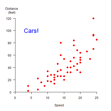
plot(cars, xlab='Speed', ylab='', pch=20, cex=2, col='red', xlim = c(0,27), ylim=c(0,125), axes=FALSE, xaxs="i", yaxs="i")
axis(1)
axis(2, las=1)
text(5, 100, 'Cars!', cex=2, col='blue')
par(xpd=NA)
text(-1, 133, 'Distance\n(feet)')
We can change the symbols using another variable. Let’s say we have three car brands and that we want to vary the symbol type, color, and size by brand (typically one of these changes should suffice to distinguish them!).
set.seed(0)
brands <- c('Buick', 'Chevrolet', 'Ford')
b <- sample(brands, nrow(cars), replace=TRUE)
i <- match(b, brands)
plot(cars, pch=i+1, cex=i, col=rainbow(3)[i])
j <- 1:length(brands)
legend(5, 120, brands, pch=(j+1), pt.cex=j, col=rainbow(3), cex=1.5)
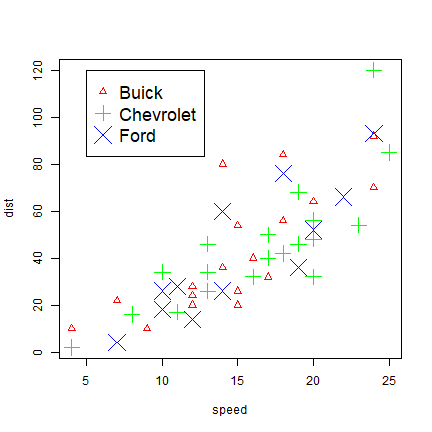
The important step is the use of match, that creates for each
character string a matching number that can be used to set the character
type desired.
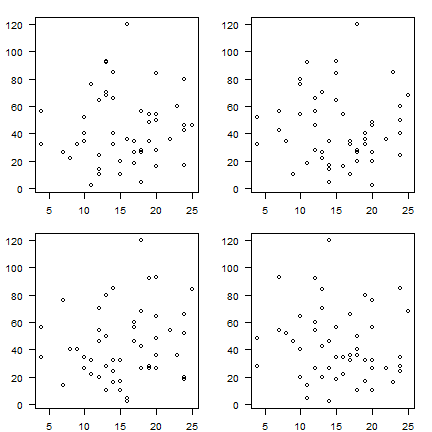
As you have seen above, plot takes many variables. Several other
parameters influencing your plot, can be set with par. See ?par
for details. Here I use it to create 4 subplots (mfrow=c(2,2) with
non-default margins (mar=c(2,3,1.5,1.5)).
par(mfrow=c(2,2), mar=c(2,3,1.5,1.5))
for (i in 1:4) {
    plot(sample(cars[,1]), sample(cars[,2]), xlab='', ylab='', las=1)
}
Some other base plots
Now consider the InsectSprays dataset
head(InsectSprays)
##   count spray
## 1    10     A
## 2     7     A
## 3    20     A
## 4    14     A
## 5    14     A
## 6    12     A
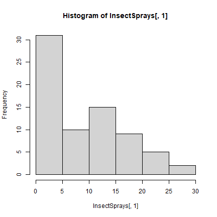
hist(InsectSprays[,1])
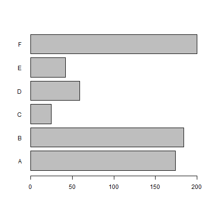
x <- aggregate(InsectSprays[,1,drop=F], InsectSprays[,2,drop=F], sum)
barplot(x[,2], names=x[,1], horiz=T, las=1)
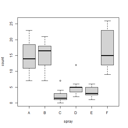
boxplot(count ~ spray, data = InsectSprays, col = "lightgray")
Exploring the iris data set
Now let’s have a look at the ‘iris’ dataset. It has 150 observations of 5 variables for 3 species of iris.
data(iris)
str(iris)
## 'data.frame':    150 obs. of  5 variables:
##  $ Sepal.Length: num  5.1 4.9 4.7 4.6 5 5.4 4.6 5 4.4 4.9 ...
##  $ Sepal.Width : num  3.5 3 3.2 3.1 3.6 3.9 3.4 3.4 2.9 3.1 ...
##  $ Petal.Length: num  1.4 1.4 1.3 1.5 1.4 1.7 1.4 1.5 1.4 1.5 ...
##  $ Petal.Width : num  0.2 0.2 0.2 0.2 0.2 0.4 0.3 0.2 0.2 0.1 ...
##  $ Species     : Factor w/ 3 levels "setosa","versicolor",..: 1 1 1 1 1 1 1 1 1 1 ...
Default plot characteristics are not satisfactory most of the time. You may want different heading, labels of x and y axis or different color of lines/points/bars. There is a large number of graphical parameters to set these. Here are some examples.
Scatter plot
Note how the scatter plot type is controlled by type parameter.
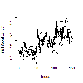
plot(iris$Sepal.Length, type = 'l')

plot(iris$Sepal.Length, type = 'p')
plot(iris$Sepal.Length, type = 'o')
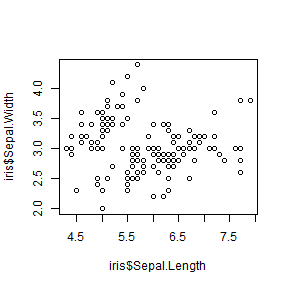
plot(iris$Sepal.Length, iris$Sepal.Width, type = 'p')
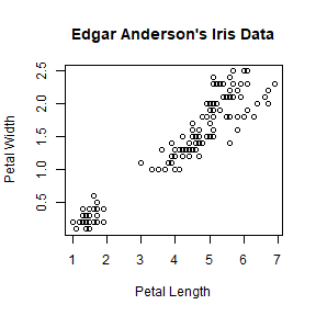
Titles and axis labels
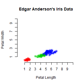
plot(iris$Petal.Length, iris$Petal.Width, main = "Edgar Anderson's Iris Data",
     xlab = "Petal Length", ylab = "Petal Width")
The font size can be changed by cex.main and cex.lab argument.
Try setting cex.lab = 2 to increase the font size of the axes.
cex.axis controls the size of axis tick values.
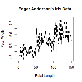
Plotting characters
You can use lty to change the line type, and pch to choose a
point type.
plot(iris$Sepal.Length, type = 'l', lty = 2, lwd = 2,
     main = "Edgar Anderson's Iris Data", xlab = "Petal Length", ylab = "Petal Width")
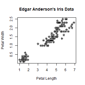
plot(iris$Petal.Length, iris$Petal.Width, pch = 8,
     main = "Edgar Anderson's Iris Data", xlab = "Petal Length", ylab = "Petal Width")
There are many choices for pch. You can use example("pch"), or
do plot(1:25, pch=1:25) to see the some plotting characters. Instead
of a code, you can also specify the character like in pch="&".
The size of a point character (pch) can be controlled with cex
argument.
Colors
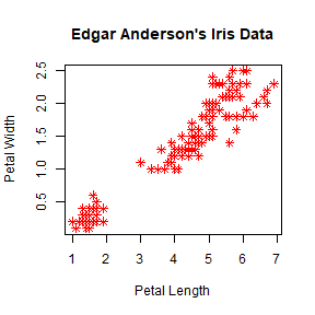
plot(iris$Petal.Length, iris$Petal.Width, pch = 8, col = 'red',
     main = "Edgar Anderson's Iris Data", xlab = "Petal Length", ylab = "Petal Width")
We can link a color to a value.
mycolor <- c("red","green3","blue")[as.factor(iris$Species)]
plot(iris$Petal.Length, iris$Petal.Width, pch = 8, col = mycolor,
     main = "Edgar Anderson's Iris Data", xlab = "Petal Length", ylab = "Petal Width")
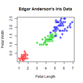
Note that the length of col vector should be equal to the number of
items you are plotting.
You can use colors() to see a list of named colors.
Axes
To change the range of an axis you can use xlim and/or ylim
argument(s).
plot(iris$Petal.Length, iris$Petal.Width, pch = 8, col = mycolor,
     main = "Edgar Anderson's Iris Data", xlab = "Petal Length", ylab = "Petal Width",
     xlim = c(0,10), ylim= c(0,10))
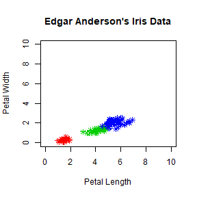
You can also set xlim and ylim with range. Try
xlim = range(iris$Petal.Length).
Use axis function to change the tick position and annotations (axes
labels). First you need to turn off the default axes.
plot(iris$Petal.Length, iris$Petal.Width, pch = 8, col = mycolor,
     main = "Edgar Anderson's Iris Data", xlab = "Petal Length", ylab = "Petal Width",
     xlim = c(0,10), ylim= c(0,10), axes = FALSE)
axis(1, at = 1:10, lab = c(1:10))
axis(2, at = 1:10, lab = c(1:10))
Interacting with plots
You can use identify() to identify a particular point in the plot.
Try identify(iris$Petal.Length, iris$Petal.Width). You can left
click with the mouse to identify multiple points. Once complete use
ESC to end the process.
You can use locator() to find out the coordinates at a particular
position on a graph. Try locator() . You can left click with the
mouse any number of times within the axes and use ESC to end the
process. A list of X and Y coordinates of the positions clicked will be
returned. You can retain this information by assigning a variable to
locator before starting it: loc <- locator(). The coordinates will
be stored as loc$x and loc$y. locator is particularly useful
to add additional information to the graph. See the following example.
Legend
We use a different color to represent each species of iris. We can
create a legend for this information using legend function.
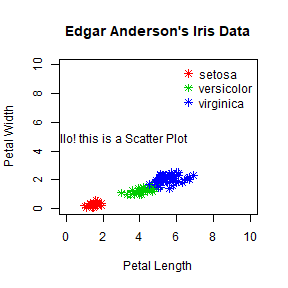
plot(iris$Petal.Length, iris$Petal.Width, pch = 8, col = mycolor,
     main = "Edgar Anderson's Iris Data", xlab = "Petal Length", ylab = "Petal Width",
     xlim = c(0,10), ylim= c(0,10))
legend('topright', legend = unique(iris$Species), col = c("red","green3","blue"), pch = 8)

To make a legend with no border use bty = 'n'.
###Add text
Often we want include additional text in the plot. locator can be
used to find the approximate x and y coordinates where you want to place
the text. Use loc <- locator().
loc <- list()
loc$x <- 2.75
loc$y <- 4.94
plot(iris$Petal.Length, iris$Petal.Width, pch = 8, col = mycolor,
     main = "Edgar Anderson's Iris Data", xlab = "Petal Length", ylab = "Petal Width",
     xlim = c(0,10), ylim= c(0,10))
legend('topright', legend = unique(iris$Species), col = c("red","green3","blue"),
       pch = 8, bty = 'n')
text(loc$x, loc$y, labels = "Hello! this is a Scatter Plot")
Multiple plots
To combine multiple plots in one image you can use layout() or
par(). For example, 4 plots can be combined with
layout(matrix(1:4, 2, 2)) or par(mfrow=c(2,2)).
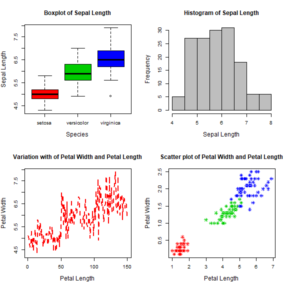
par(mfrow=c(2,2))
boxplot(iris$Sepal.Length~iris$Species, main = "Boxplot of Sepal Length",
        xlab = "Species", ylab = "Sepal Length", col = c("red","green3","blue"),
        cex.lab = 1.25)
hist(iris$Sepal.Length, main = "Histogram of Sepal Length",
     xlab = "Sepal Length", ylab = "Frequency", col = c("grey"), cex.lab = 1.25)
plot(iris$Sepal.Length, type = 'l', lty = 2, lwd = 2, col = 'red',
     main = "Variation with of Petal Width and Petal Length",
     xlab = "Petal Length", ylab = "Petal Width", cex.lab = 1.25)
plot(iris$Petal.Length, iris$Petal.Width, pch = 8, col = mycolor,
     main = "Scatter plot of Petal Width and Petal Length",
     xlab = "Petal Length", ylab = "Petal Width", cex.lab = 1.25)
Saving plots
You can directly write a plot to a file such as pdf of png. To
save any of the above plots in a pdf file called theplot.pdf you
first open the pdf device, then do the plotting and use
dev.off() when done.
pdf("theplot.pdf")
boxplot(iris$Sepal.Length~Species, main = "Boxplot of Sepal Length",
        xlab = "Species", ylab = "Sepal Length", col = c("red","green3","blue"))
dev.off()
For plotting to an image file, you can use png and other formats. To
set the device size (dimensions and resolution), you can use a few
parameters
png(filename = "myplot.png", width = 200, height = 300, units = "cm", res = 300)
boxplot(iris$Sepal.Length~iris$Species, main = "Boxplot of Sepal Length",
        xlab = "Species", ylab = "Sepal Length", col = c("red","green3","blue"))
dev.off()
You should now have a file called “myplot.png” in your working directory.
Summary
Some different plot types
+ `plot( )`                Scatter plot, and general plotting
+ `hist( )`                Histogram
+ `stem( )`                Stem-and-leaf
+ `boxplot( )`             Boxplot
+ `qqnorm( )`              Normal probability plot
+ `mosaicplot( )`          Mosaic plot
Add elements to a plot
+ `points( )`              Add points
+ `lines( )`               Add lines
+ `text( )`                Add text
+ `abline( )`              Add lines
+ `legend( )`              Add legend
Important graphical parameters
+ `par( )`                 Set parameters for plotting
+ `cex`                    Font size
+ `col`                    Color of plotting symbols
+ `lty`                    Line type
+ `lwd`                    Line width
+ `mar`                    Inner margins
+ `mfrow`                  Multiple figures per image
+ `oma`                    Outer margins
+ `pch`                    Plotting symbol
+ `xlim`                   Min and max of X axis range
+ `ylim`                   Min and max of Y axis range
Resources
Additional resources you may want to consult are the R demo for
different types of plots: demo("graphics") and the help for plot
(?plot).
There is also a comprehensive gallery of plots