Pitfalls and potential
Introduction
This page shows how you can implement the examples provided in Chapter 2 of O’Sullivan and Unwin (2010). To get most out of this, go through the examples slowly, line by line. You should inspect the objects created and read the help files associated with the functions used.
The Modifiable Areal Unit Problem
Below we recreate the data shown on page 37. There is one region that is divided into 6 x 6 = 36 grid cells. For each cell we have values for two variables. These gridded data can be represented as a matrix, but the easiest way to enter the values is to use a vector (which we can transform to a matrix later). I used line breaks for ease of comparison with the book such that it looks like a matrix anyway.
# independent variable
ind <- c(87, 95, 72, 37, 44, 24,
         40, 55, 55, 38, 88, 34,
         41, 30, 26, 35, 38, 24,
         14, 56, 37, 34,  8, 18,
         49, 44, 51, 67, 17, 37,
         55, 25, 33, 32, 59, 54)
# dependent variable
dep <- c(72, 75, 85, 29, 58, 30,
         50, 60, 49, 46, 84, 23,
         21, 46, 22, 42, 45, 14,
         19, 36, 48, 23,  8, 29,
         38, 47, 52, 52, 22, 48,
         58, 40, 46, 38, 35, 55)
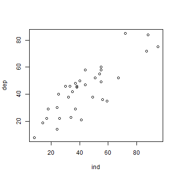
Now that we have the values, we can make a scatter plot.
plot(ind, dep)
And here is how you can fit a linear regression model using the glm
function. dep ~ ind means ‘dep’ is a function of ‘ind’.
m <- glm(dep ~ ind)
Now let’s look at our model m.
m
##
## Call:  glm(formula = dep ~ ind)
##
## Coefficients:
## (Intercept)          ind
##     10.3750       0.7543
##
## Degrees of Freedom: 35 Total (i.e. Null);  34 Residual
## Null Deviance:       12080
## Residual Deviance: 3742  AIC: 275.3
To get a bit more information about m, we can use the summary
function.
s <- summary(m)
s
##
## Call:
## glm(formula = dep ~ ind)
##
## Deviance Residuals:
##     Min       1Q   Median       3Q      Max
## -20.303   -8.536    3.293    7.466   20.312
##
## Coefficients:
##             Estimate Std. Error t value Pr(>|t|)
## (Intercept) 10.37497    4.12773   2.513   0.0169 *
## ind          0.75435    0.08668   8.703 3.61e-10 ***
## ---
## Signif. codes:  0 '***' 0.001 '**' 0.01 '*' 0.05 '.' 0.1 ' ' 1
##
## (Dispersion parameter for gaussian family taken to be 110.0631)
##
##     Null deviance: 12078.8  on 35  degrees of freedom
## Residual deviance:  3742.1  on 34  degrees of freedom
## AIC: 275.34
##
## Number of Fisher Scoring iterations: 2
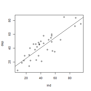
We can use m to add a regression line to our scatter plot.
plot(ind, dep)
abline(m)
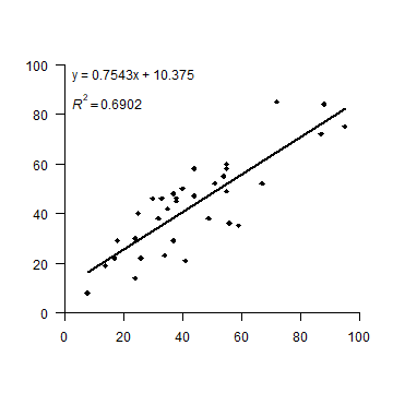
OK. But let’s see how to make a plot that looks more like the one in the
book. I first set up a plot without axes, and then add the two axes I
want (in stead of the standard box). las=1 rotates the labels to a
horizontal position. The arguments yaxs="i", and xaxs="i" force
the axes to be drawn at the edges of the plot window (overwriting the
default to enlarge the ranges by 6%). To get the filled diamond symbol,
I use pch=18. See plot(1:25, pch=1:25) for more numbered
symbols.
Then I add the formula by extracting the coefficients from the
regression summary object s that was created above, and by
concatenating the text elements with the paste0 function. Creating
the superscript in R2 also takes some fiddling. Don’t worry
about understanding the details of that. There are a few alternative
ways to do this, all of them can be found
on-line,
so there is no need to remember how to do it.
The regression line should only cover the range (min to max value) of
variable ind. An easy way to do that is to use the regression model
to predict values for these extremes and draw a line between these.
plot(ind, dep, pch=18, xlim=c(0,100), ylim=c(0,100),
    axes=FALSE, xlab='', ylab='', yaxs="i", xaxs="i")
axis(1, at=(0:5)*20)
axis(2, at=(0:5)*20, las=1)
# create regression formula
f <- paste0('y = ', round(s$coefficients[2], 4), 'x + ', round(s$coefficients[1], 4))
# add the text in variable f to the plot
text(0, 96, f, pos=4)
# compute r-squared
R2 <- cor(dep, predict(m))^2
# set up the expression (a bit complex, this)
r2 <- bquote(italic(R)^2 == .(round(R2, 4)))
# and add it to the plot
text(0, 85, r2, pos=4)
# compute regression line
# create a data.frame with the range (minimum and maximum) of values of ind
px <- data.frame(ind = range(ind))
# use the regression model to get predicted value for dep at these two extremes
py <- predict(m, px)
# combine the min and max values and the predicted values
ln <- cbind(px, py)
# add to the plot as a line
lines(ln, lwd=2)
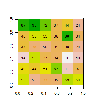
Now the aggregation. I first turn the vectors into matrices, which is
very easy to do. You should play with the matrix function a bit to see
how it works. It is particularly important that you understand the
argument byrow=TRUE. By default R fills matrices column-wise.
mi <- matrix(ind, ncol=6, nrow=6, byrow=TRUE)
md <- matrix(dep, ncol=6, nrow=6, byrow=TRUE)
Question 1: Create these matrices from ind and dep
without using byrow=TRUE. Hint: use the t function after
you made the matrix.
The type of aggregation as shown in Figure 2.1 is not a very typical
operation in the context of matrix manipulation. However, it is very
common to do this with raster data. So let’s first transform the
matrices to objects that represent raster data, RasterLayer objects
in this case. This class is defined in the raster package, so we
need to load that first. If library(raster) gives this error:
Error in library("raster") : there is no package called ‘raster’ you
need to install the package first, using this command:
install.packages('raster').
# load package
library(raster)
# turn matrices into RasterLayer objects
ri <- raster(mi)
rd <- raster(md)
Inspect one of these new objects
ri
## class      : RasterLayer
## dimensions : 6, 6, 36  (nrow, ncol, ncell)
## resolution : 0.1666667, 0.1666667  (x, y)
## extent     : 0, 1, 0, 1  (xmin, xmax, ymin, ymax)
## crs        : NA
## source     : memory
## names      : layer
## values     : 8, 95  (min, max)
plot(ri, legend=FALSE)
text(ri)
The raster package has an aggregate function that we will use. We
specify that we want to aggregate sets of 2 columns, but not aggregate
rows. The values for the new cells should be computed from the original
cells using the mean function.
Question 2: Instead of the ``mean`` function What other functions could, in principle, reasonably be used in an aggregation of raster cells?
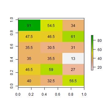
ai1 <- aggregate(ri, c(2, 1), fun=mean)
ad1 <- aggregate(rd, c(2, 1), fun=mean)
Inspect the results
as.matrix(ai1)
##      [,1] [,2] [,3]
## [1,] 91.0 54.5 34.0
## [2,] 47.5 46.5 61.0
## [3,] 35.5 30.5 31.0
## [4,] 35.0 35.5 13.0
## [5,] 46.5 59.0 27.0
## [6,] 40.0 32.5 56.5
plot(ai1)
text(ai1, digits=1)
To be able to do the regression as we did above, I first combine the two
RasterLayer objects into a (multi-layer) RasterStack object.
s1 <- stack(ai1, ad1)
names(s1) <- c('ind', 'dep')
s1
## class      : RasterStack
## dimensions : 6, 3, 18, 2  (nrow, ncol, ncell, nlayers)
## resolution : 0.3333333, 0.1666667  (x, y)
## extent     : 0, 1, 0, 1  (xmin, xmax, ymin, ymax)
## crs        : NA
## names      :  ind,  dep
## min values : 13.0, 18.5
## max values : 91.0, 73.5
plot(s1)
Below I coerce the RasterStack into a data.frame. In R, most
functions for statistical analysis want the input data as a
data.frame.
d1 <- as.data.frame(s1)
head(d1)
##    ind  dep
## 1 91.0 73.5
## 2 54.5 57.0
## 3 34.0 44.0
## 4 47.5 55.0
## 5 46.5 47.5
## 6 61.0 53.5
To recap: each matrix was used to create a RasterLayer that we
aggregated and then stacked. Each of the stacked and aggregated
RasterLayer objects became a single variable (column) in the
data.frame. If would perhaps have been more efficient to first make
a RasterStack and then aggregate.
Question 3: There are other ways to do the above (converting two
RasterLayer objects to a data.frame). Show how to obtain
the same result (d1) using as.vector and cbind.
Let’s fit a regression model again, now with these aggregated data:
ma1 <- glm(dep~ind, data=d1)
Same idea for for the other aggregation (‘Aggregation scheme 2’). But
note that the arguments to the aggregate function are, of course,
different.
ai2 <- aggregate(ri, c(1, 2), fun=mean)
ad2 <- aggregate(rd, c(1, 2), fun=mean)
plot(ai2)
text(ai2, digits=1, srt=90)
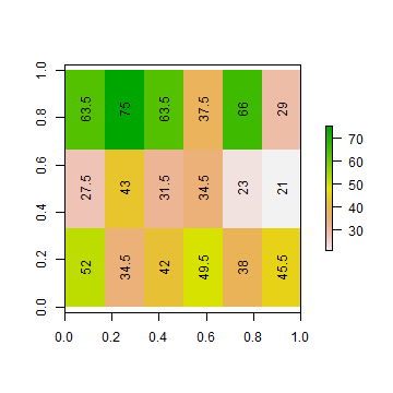
s2 <- stack(ai2, ad2)
names(s2) <- c('ind', 'dep')
# coerce to data.frame
d2 <- as.data.frame(s2)
ma2 <- glm(dep ~ ind, data=d2)
Now we have three regression model objects. We first created object
m, and then the two models with aggregated data: ma1 and
ma2. Compare the regression model coefficients.
m$coefficients
## (Intercept)         ind
##  10.3749675   0.7543472
ma1$coefficients
## (Intercept)         ind
##  13.5899183   0.6798216
ma2$coefficients
## (Intercept)         ind
##   1.2570386   0.9657093
Re-creating figure 2.1 takes some effort. We want to make a similar
figure three times (two matrices and a plot). That makes it efficient
and practical to use a function. Look
here if you do not
remember how to write and use your own function in R:
The function I wrote, called plotMAUP, is a bit complex, so I do not
show it here. But you can find it in the source
code for this page. Have a look at
it if you can, don’t worry about the details, but see if you can
understand the main reason for each step. It helps to try the lines of
the function one by one (outside of the function).
To use the plotMAUP function, I first set up a plotting canvas of 3
rows and 3 columns, using the mfrow argument in the par
function. The par function is very important for customizing plots —
and it has an overwhelming number of options to consider. See ?par.
The mai argument is used to change the margins around each plot.
# plotting parameters
par(mfrow=c(3,3), mai=c(0.25,0.15,0.25,0.15))
# Now call plotMAUP 3 times
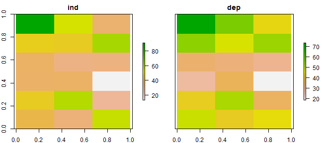
plotMAUP(ri, rd, title=c('Independent variable', 'Dependent variable'))
# aggregation scheme 1
plotMAUP(ai1, ad1, title='Aggregation scheme 1')
# aggregation scheme 2
plotMAUP(ai2, ad2, title='Aggregation scheme 2')
Figure 2.1 An illustration of MAUP
Distance, adjacency, interaction, neighborhood
Here we explore the data in Figure 2.2 (page 46). The values used are not exactly the same (as they were not provided in the text), but it is all very similar.
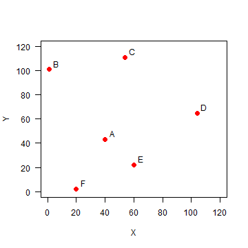
Set up the data, using x-y coordinates for each point:
A <- c(40, 43)
B <- c(1, 101)
C <- c(54, 111)
D <- c(104, 65)
E <- c(60, 22)
F <- c(20, 2)
pts <- rbind(A,B,C,D,E,F)
head(pts)
##   [,1] [,2]
## A   40   43
## B    1  101
## C   54  111
## D  104   65
## E   60   22
## F   20    2
Plot the points and labels:
plot(pts, xlim=c(0,120), ylim=c(0,120), pch=20, cex=2, col='red', xlab='X', ylab='Y', las=1)
text(pts+5, LETTERS[1:6])
Distance
It is easy to make a distance matrix (see page 47)
dis <- dist(pts)
dis
##           A         B         C         D         E
## B  69.89278
## C  69.42622  53.93515
## D  67.67570 109.11004  67.94115
## E  29.00000  98.60020  89.20202  61.52235
## F  45.61798 100.80675 114.17968 105.00000  44.72136
D <- as.matrix(dis)
round(D)
##    A   B   C   D  E   F
## A  0  70  69  68 29  46
## B 70   0  54 109 99 101
## C 69  54   0  68 89 114
## D 68 109  68   0 62 105
## E 29  99  89  62  0  45
## F 46 101 114 105 45   0
Distance matrices are used in all kinds of non-geographical applications. For example, they are often used to create cluster diagrams (dendograms).
Question 4: Show R code to make a cluster dendogram summarizing the
distances between these six sites, and plot it. See ?hclust.
Adjacency
Distance based adjacency
To get the adjacency matrix, here defined as points within a distance of
50 from each other is trivial given that we have the distances D.
a <-  D < 50
a
##       A     B     C     D     E     F
## A  TRUE FALSE FALSE FALSE  TRUE  TRUE
## B FALSE  TRUE FALSE FALSE FALSE FALSE
## C FALSE FALSE  TRUE FALSE FALSE FALSE
## D FALSE FALSE FALSE  TRUE FALSE FALSE
## E  TRUE FALSE FALSE FALSE  TRUE  TRUE
## F  TRUE FALSE FALSE FALSE  TRUE  TRUE
To make this match matrix 2.6 on page 48, set the diagonal values to
NA (we do not consider a point to be adjacent to itself). Also
change the change the TRUE/FALSE values to to 1/0 using a simple
trick (multiplication with 1)
diag(a) <- NA
adj50 <- a * 1
adj50
##    A  B  C  D  E  F
## A NA  0  0  0  1  1
## B  0 NA  0  0  0  0
## C  0  0 NA  0  0  0
## D  0  0  0 NA  0  0
## E  1  0  0  0 NA  1
## F  1  0  0  0  1 NA
Three nearest neighbors
Computing the “three nearest neighbors” adjacency-matrix requires a bit
more advanced understanding of R.
For each row, we first get the column numbers in order of the values in that row (that is, the numbers indicate how the values are ordered).
cols <- apply(D, 1, order)
# we need to transpose the result
cols <- t(cols)
And then get columns 2 to 4 (why not column 1?)
cols <- cols[, 2:4]
cols
##   [,1] [,2] [,3]
## A    5    6    4
## B    3    1    5
## C    2    4    1
## D    5    1    3
## E    1    6    4
## F    5    1    2
As we now have the column numbers, we can make the row-column pairs that
we want (rowcols).
rowcols <- cbind(rep(1:6, each=3), as.vector(t(cols)))
head(rowcols)
##      [,1] [,2]
## [1,]    1    5
## [2,]    1    6
## [3,]    1    4
## [4,]    2    3
## [5,]    2    1
## [6,]    2    5
We use these pairs as indices to change the values in matrix Ak3.
Ak3 <- adj50 * 0
Ak3[rowcols] <- 1
Ak3
##    A  B  C  D  E  F
## A NA  0  0  1  1  1
## B  1 NA  1  0  1  0
## C  1  1 NA  1  0  0
## D  1  0  1 NA  1  0
## E  1  0  0  1 NA  1
## F  1  1  0  0  1 NA
Weights matrix
Getting the weights matrix is simple.
W <- 1 / D
round(W, 4)
##        A      B      C      D      E      F
## A    Inf 0.0143 0.0144 0.0148 0.0345 0.0219
## B 0.0143    Inf 0.0185 0.0092 0.0101 0.0099
## C 0.0144 0.0185    Inf 0.0147 0.0112 0.0088
## D 0.0148 0.0092 0.0147    Inf 0.0163 0.0095
## E 0.0345 0.0101 0.0112 0.0163    Inf 0.0224
## F 0.0219 0.0099 0.0088 0.0095 0.0224    Inf
Row-normalization is not that difficult either. First get rid if the
Inf values by changing them to NA. (Where did the Inf values
come from?)
W[!is.finite(W)] <- NA
Then compute the row sums.
rtot <- rowSums(W, na.rm=TRUE)
# this is equivalent to
# rtot <- apply(W, 1, sum, na.rm=TRUE)
rtot
##          A          B          C          D          E          F
## 0.09989170 0.06207541 0.06763182 0.06443810 0.09445017 0.07248377
Divide the rows by their totals and check if they row sums add up to 1.
W <- W / rtot
rowSums(W, na.rm=TRUE)
## A B C D E F
## 1 1 1 1 1 1
The values in the columns do not add up to 1.
colSums(W, na.rm=TRUE)
##         A         B         C         D         E         F
## 1.3402904 0.8038417 0.9108116 0.8166821 1.2350790 0.8932953
Question 5: Show how you can do ‘column-normalization’ (Just an exercise, in spatial data analysis this is not a typical thing to do).
Proximity polygons
Proximity polygons are discussed on pages 50-52. Here I show how you can
compute these with the voronoi function in the dismo package. We
use the data from the previous example.
library(dismo)
library(deldir)
v <- voronoi(pts)
Here is a plot of our proximity polygons (also known as a Voronoi diagram).
par(mai=rep(0,4))
plot(v, lwd=4, border='gray', col=rainbow(6))
points(pts, pch=20, cex=2)
text(pts+5, toupper(letters[1:6]), cex=1.5)
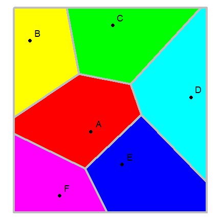
Note that the voronoi functions returns a
SpatialPolygonsDataFrame, a class defined in the package sp.
This is the class (type of object) that we use to represent geospatial
polygons in R.
class(v)
## [1] "SpatialPolygonsDataFrame"
## attr(,"package")
## [1] "sp"
v
## class       : SpatialPolygonsDataFrame
## features    : 6
## extent      : -9.3, 114.3, -8.9, 121.9  (xmin, xmax, ymin, ymax)
## crs         : NA
## variables   : 1
## names       : id
## min values  :  1
## max values  :  6
Question 6. The SpatialPolygonDataFrame class is defined in
package sp. But we never used library('sp') . So how is it
possible that we have one of such objects?