Basic mathematical operations
The raster package supports many mathematical operations. Math
operations are generally performed per pixel (grid cell). First we will
do some basic arithmetic operations to combine bands. In the first
example we write a custom math function to calculate the Normalized
Difference Vegetation Index (NDVI). Learn more about vegetation indices
here
and NDVI.
We use the same Landsat data as in Chapter 2.
library(raster)
raslist <- paste0('data/rs/LC08_044034_20170614_B', 1:11, ".tif")
landsat <- stack(raslist)
landsatRGB <- landsat[[c(4,3,2)]]
landsatFCC <- landsat[[c(5,4,3)]]
Vegetation indices
Let’s define a general function for a ratio based (vegetation) index. In
the function below, img is a mutilayer Raster* object and i and
k are the indices of the layers (layer numbers) used to compute the
vegetation index.
vi <- function(img, k, i) {
  bk <- img[[k]]
  bi <- img[[i]]
  vi <- (bk - bi) / (bk + bi)
  return(vi)
}
# For Landsat NIR = 5, red = 4.
ndvi <- vi(landsat, 5, 4)
plot(ndvi, col = rev(terrain.colors(10)), main = "Landsat-NDVI")
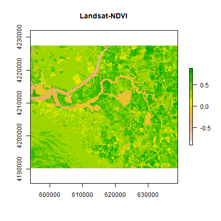
You can see the variation in greenness from the plot.
An alternative way to accomplish this is like this
vi2 <- function(x, y) {
    (x - y) / (x + y)
}
ndvi2 <- overlay(landsat[[5]], landsat[[4]], fun=vi2)
plot(ndvi2, col=rev(terrain.colors(10)), main="Landsat-NDVI")

Question 1: Adapt the code shown above to compute indices to identify i) water and ii) built-up. Hint: Use the spectral profile plot to find the bands having maximum and minimum reflectance for these two classes.
Histogram
We can explore the distribution of values contained within our raster using the hist() function which produces a histogram. Histograms are often useful in identifying outliers and bad data values in our raster data.
# view histogram of data
hist(ndvi,
     main = "Distribution of NDVI values",
     xlab = "NDVI",
     ylab= "Frequency",
     col = "wheat",
     xlim = c(-0.5, 1),
     breaks = 30,
     xaxt = 'n')
axis(side=1, at = seq(-0.5,1, 0.05), labels = seq(-0.5,1, 0.05))
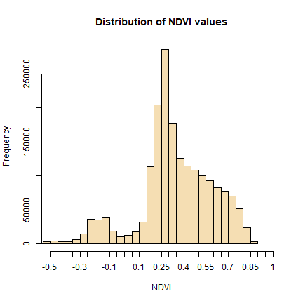
We will refer to this histogram for the following sub-section on thresholding.
Question 2: Make histograms of the values the vegetation indices developed in question 1.
Thresholding
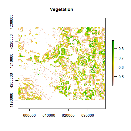
We can apply basic rules to get an estimate of spatial extent of different Earth surface features. Note that NDVI values are standardized and ranges between -1 to +1. Higher values indicate more green cover.
Cells with NDVI values greater than 0.4 are definitely vegetation. The following operation masks all cells that are perhaps not vegetation.
veg <- reclassify(ndvi, cbind(-Inf, 0.4, NA))
plot(veg, main='Vegetation')
Let’s map the area that corresponds to the peak between 0.25 and 0.3 in the NDVI histogram.
land <- reclassify(ndvi, c(-Inf, 0.25, NA,  0.25, 0.3, 1,  0.3, Inf, NA))
plot(land, main = 'What is it?')
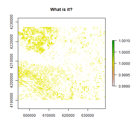
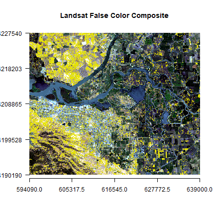
These may be the open areas. You can plot land over original
landsatFCC raster to find out more.
plotRGB(landsatRGB, r=1, g=2, b=3, axes=TRUE, stretch="lin", main="Landsat False Color Composite")
plot(land, add=TRUE, legend=FALSE)
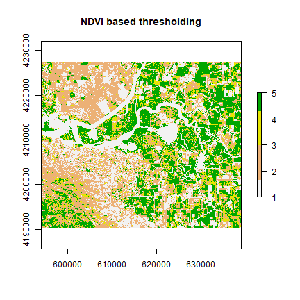
You can also create classes for different amount of vegetation presence.
vegc <- reclassify(ndvi, c(-Inf,0.25,1, 0.25,0.3,2, 0.3,0.4,3, 0.4,0.5,4, 0.5,Inf, 5))
plot(vegc,col = rev(terrain.colors(4)), main = 'NDVI based thresholding')
Question 3: Is it possible to find water using thresholding of NDVI or any other indices?
Principal component analysis
Multi-spectral data are sometimes transformed to helps to reduce the dimensionality and noise in the data. The principal components transform is a generic data reduction method that can be used to create a few uncorrelated bands from a larger set of correlated bands.
You can calculate the same number of principal components as the number of input bands. The first principal component (PC) explains the largest percentage of variance and other PCs explain additional the variance in decreasing order.
set.seed(1)
sr <- sampleRandom(landsat, 10000)
plot(sr[,c(4,5)], main = "NIR-Red plot")
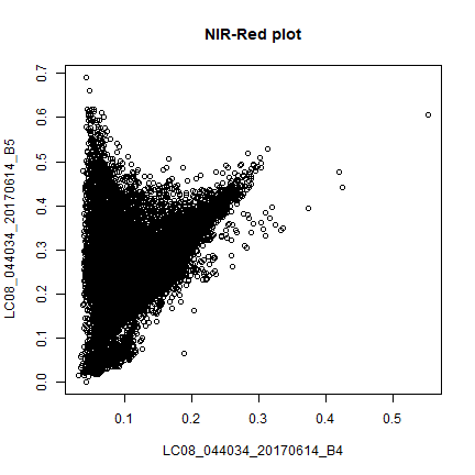
This is known as vegetation and soil-line plot (Same as the scatter plot in earlier section).
pca <- prcomp(sr, scale = TRUE)
pca
## Standard deviations (1, .., p=11):
## [1] 2.52687022 1.40533428 1.09901821 0.92507423 0.53731672 0.42657919
## [7] 0.28002273 0.12466139 0.09031384 0.04761419 0.03609857
##
## Rotation (n x k) = (11 x 11):
## PC1 PC2 PC3 PC4
## LC08_044034_20170614_B1 0.2973469 -0.3516438 -0.29454767 -0.06983456
## LC08_044034_20170614_B2 0.3387629 -0.3301194 -0.16407835 -0.03803678
## LC08_044034_20170614_B3 0.3621173 -0.2641152 0.07373240 0.04090884
## LC08_044034_20170614_B4 0.3684797 -0.1659582 0.10260552 0.03680852
## LC08_044034_20170614_B5 0.1546322 0.1816252 0.71354112 0.32017620
## LC08_044034_20170614_B6 0.3480230 0.2108982 0.23064060 0.16598851
## LC08_044034_20170614_B7 0.3496281 0.2384417 -0.11662258 0.07600209
## LC08_044034_20170614_B8 0.3490464 -0.2007305 0.08765521 0.02303421
## LC08_044034_20170614_B9 0.1314827 0.1047365 0.33741447 -0.92325315
## LC08_044034_20170614_B10 0.2497611 0.4912132 -0.29286315 -0.02950655
## LC08_044034_20170614_B11 0.2472765 0.4931489 -0.29515754 -0.03176549
## PC5 PC6 PC7 PC8
## LC08_044034_20170614_B1 0.49474685 0.175510232 -0.23948553 0.215745065
## LC08_044034_20170614_B2 0.22121122 0.094184121 0.06447037 0.216537517
## LC08_044034_20170614_B3 0.08482031 0.009040232 0.30511210 -0.518233675
## LC08_044034_20170614_B4 -0.33835490 -0.066844529 0.60174786 0.012437959
## LC08_044034_20170614_B5 0.51960822 -0.059561476 -0.07348455 -0.083217504
## LC08_044034_20170614_B6 -0.29437062 0.317984598 -0.02106132 0.632178645
## LC08_044034_20170614_B7 -0.25404931 0.525411720 -0.40543545 -0.478543437
## LC08_044034_20170614_B8 -0.31407992 -0.673584139 -0.52642131 0.003527306
## LC08_044034_20170614_B9 0.03040161 0.059642905 -0.03152221 -0.002775800
## LC08_044034_20170614_B10 0.16317572 -0.243735973 0.14341520 0.041736319
## LC08_044034_20170614_B11 0.19294569 -0.241611777 0.11997475 -0.022446494
## PC9 PC10 PC11
## LC08_044034_20170614_B1 0.122812108 0.535959306 0.1203473847
## LC08_044034_20170614_B2 0.091063964 -0.773112627 -0.1817872036
## LC08_044034_20170614_B3 -0.644305383 0.070860458 0.0540175730
## LC08_044034_20170614_B4 0.543822097 0.218324141 0.0135097158
## LC08_044034_20170614_B5 0.209682702 -0.040186292 -0.0004965182
## LC08_044034_20170614_B6 -0.397210135 0.089423617 -0.0045305608
## LC08_044034_20170614_B7 0.248871690 -0.074907393 0.0003958921
## LC08_044034_20170614_B8 -0.012642132 0.002411975 0.0007749022
## LC08_044034_20170614_B9 0.003176077 -0.000832654 0.0019986985
## LC08_044034_20170614_B10 -0.003574004 -0.158727672 0.6900281980
## LC08_044034_20170614_B11 -0.043475408 0.148102091 -0.6878990264
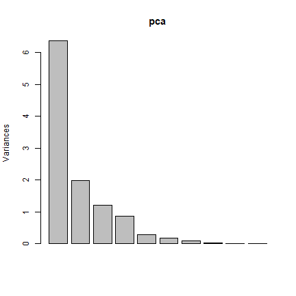
screeplot(pca)
pci <- predict(landsat, pca, index = 1:2)
plot(pci[[1]])
The first principal component highlights the boundaries between land use classes or spatial details, which is the most common information among all wavelengths. it is difficult to understand what the second principal component is highlighting. Lets try thresholding again:
pc2 <- reclassify(pci[[2]], c(-Inf,0,1,0,Inf,NA))
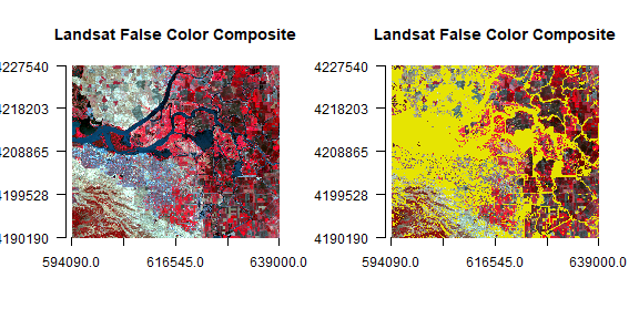
par(mfrow = c(1,2))
plotRGB(landsatFCC, r = 1, g = 2, b = 3, axes = TRUE, stretch = "lin", main = "Landsat False Color Composite")
plotRGB(landsatFCC, r = 1, g = 2, b = 3, axes = TRUE, stretch = "lin", main = "Landsat False Color Composite")
plot(pc2, legend = FALSE, add = TRUE)
To learn more about the information contained in the vegetation and soil line plots read this paper by Gitelson et al. An extension of PCA in remote sensing is known as Tasseled-cap Transformation.