3. Analyzing species distribution data
Introduction
In this case-study I show some techniques that can be used to analyze species distribution data with R. Before going through this document you should at least be somewhat familiar with R and spatial data manipulation in R. This document is based on an analysis of the distribution of wild potato species by Hijmans and Spooner (2001). Wild potatoes (Solanaceae; Solanum sect. Petota are relatives of the cultivated potato. There are nearly 200 different species that occur in the Americas.
Import and prepare data
The data we will use is available in the rspatial package. First install
that from github, using the remotes package.
if (!require("rspat")) remotes::install_github('rspatial/rspat')
## Loading required package: rspat
## Loading required package: terra
## terra 1.9.21
library(rspat)
The extracted file is a csv file (comma-seperated-by values). We can read it with:
f <- system.file("wildpot.csv", package="rspat")
basename(f)
## [1] "wildpot.csv"
v <- read.csv(f)
The coordinates in v are expressed in degrees, minutes, seconds (in
separate columns, fortunately). We need to compute longitude and
latitude as single decimal numbers.
# first coerce character values to numbers
for (i in c('LongD', 'LongM', 'LongS', 'LatD', 'LatM', 'LatS')) {
    v[, i] <- as.numeric(v[,i])
}
v$lon <- -1 * (v$LongD + v$LongM / 60 + v$LongS / 3600)
v$lat <- v$LatD + v$LatM / 60 + v$LatS / 3600
# Southern hemisphere gets a negative sign
v$lat[v$LatH == 'S'] <- -1 * v$lat[v$LatH == 'S']
head(v)
##    ID     COLNR     DATE LongD LongM LongS LongH LatD LatM LatS LatH
## 1  55  OKA 3901 19710405    65    45     0     W   22    8    0    S
## 2  16  OKA 3920 19710406    66     6     0     W   21   53    0    S
## 3 204  HOF 1848 19710305    65     5     0     W   22   16    0    S
## 4 545  OKA 4015 19710411    66    15     0     W   22   32    0    S
## 5 549  OKA 4026 19710411    66    12     0     W   22   30    0    S
## 6 551 OKA 4030A 19710411    66    12     0     W   22   28    0    S
##            SPECIES SCODE_NEW SUB_NEW SP_ID   COUNTRY  ADM1           ADM2
## 1 S. acaule Bitter       acl     ACL     1 ARGENTINA Jujuy           Yavi
## 2 S. acaule Bitter       acl     ACL     1 ARGENTINA Jujuy Santa Catalina
## 3 S. acaule Bitter       acl     ACL     1 ARGENTINA Salta Santa Victoria
## 4 S. acaule Bitter       acl     ACL     1 ARGENTINA Jujuy      Rinconada
## 5 S. acaule Bitter       acl     ACL     1 ARGENTINA Jujuy      Rinconada
## 6 S. acaule Bitter       acl     ACL     1 ARGENTINA Jujuy      Rinconada
##                                          LOCALITY PLRV1 PLRV2 FROST       lon
## 1                                          Tafna.     R     R   100 -65.75000
## 2                      10 km W of Santa Catalina.     S     R   100 -66.10000
## 3                               53 km E of Cajas.     S     R   100 -65.08333
## 4 Near Abra de Fundiciones, 10 km S of Rinconada.     S     R   100 -66.25000
## 5                         8 km SW of Fundiciones.     S     R   100 -66.20000
## 6                Salveayoc, 5 km SW of Rinconada.     S     R   100 -66.20000
##         lat
## 1 -22.13333
## 2 -21.88333
## 3 -22.26667
## 4 -22.53333
## 5 -22.50000
## 6 -22.46667
Get a SpatVector with most of the countries of the Americas.
cn <- spat_data("pt_countries")
class(cn)
## [1] "SpatVector"
## attr(,"package")
## [1] "terra"
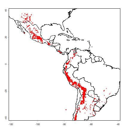
Make a quick map
plot(cn, xlim=c(-120, -40), ylim=c(-40,40), axes=TRUE)
points(v$lon, v$lat, cex=.5, col='red')
And create a SpatVector for the potato data with the formula approach
sp <- vect(v, crs="+proj=longlat +datum=WGS84")
Summary statistics
We are first going to summarize the data by country. We can use the country variable in the data, or extract that from the countries SpatVector.
table(v$COUNTRY)
##
##     ARGENTINA       BOLIVIA        BRAZIL         CHILE      COLOMBIA
##          1474           985            17           100           107
##    COSTA RICA       ECUADOR     GUATEMALA      HONDURAS        Mexico
##            24           138            59             1             2
##        MEXICO        PANAMA      PARAGUAY          Peru          PERU
##           843            13            19             1          1043
## UNITED STATES       URUGUAY     VENEZUELA
##           157             4            12
# note Peru and PERU
v$COUNTRY <- toupper(v$COUNTRY)
table(v$COUNTRY)
##
##     ARGENTINA       BOLIVIA        BRAZIL         CHILE      COLOMBIA
##          1474           985            17           100           107
##    COSTA RICA       ECUADOR     GUATEMALA      HONDURAS        MEXICO
##            24           138            59             1           845
##        PANAMA      PARAGUAY          PERU UNITED STATES       URUGUAY
##            13            19          1044           157             4
##     VENEZUELA
##            12
# same fix for the SpatVector
sp$COUNTRY <- toupper(sp$COUNTRY)
Below we determine the country using a spatial query, using the
intersect method.
vv <- intersect(sp[, "COUNTRY"], cn)
names(vv)[1] <- "ptCountry"
head(vv)
##   ptCountry COUNTRY_2
## 1 ARGENTINA ARGENTINA
## 2 ARGENTINA ARGENTINA
## 3 ARGENTINA ARGENTINA
## 4 ARGENTINA ARGENTINA
## 5 ARGENTINA ARGENTINA
## 6 ARGENTINA ARGENTINA
table(vv$COUNTRY)
## < table of extent 0 >
This table is similar to the previous table, but it is not the same. Let’s find the records that are not in the same country according to the original data and the spatial query.
# some fixes first
# apparantly in the ocean (small island missing from polygon data)
vv$COUNTRY[is.na(vv$COUNTRY)] <- ""
# some spelling differenes
vv$COUNTRY[vv$COUNTRY=="UNITED STATES, THE"] <- "UNITED STATES"
vv$COUNTRY[vv$COUNTRY=="BRASIL"] <- "BRAZIL"
i <- which(toupper(vv$ptCountry) != vv$COUNTRY)
i
## integer(0)
as.data.frame(vv[i,])
## [1] value
## <0 rows> (or 0-length row.names)
plot(cn, xlim=c(-120, -40), ylim=c(-40,40), axes=TRUE)
points(sp, cex=.25, pch='+', col='blue')
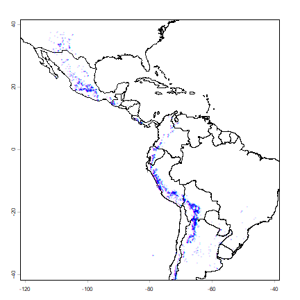
points(vv[i,], col='red', pch='x', cex=1.5)
All observations that are in a different country than their attribute data suggests are very close to an international border, or in the water. That suggests that the coordinates of the potato locations are not very precise (or the borders are inexact). Otherwise, this is reassuring (and a-typical). There are often are several inconsistencies, and it can be hard to find out whether the locality coordinates are wrong or whether the borders are wrong; but further inspection is warranted in those cases.
We can compute the number of species for each country.
spc <- tapply(v$SPECIES, sp$COUNTRY, function(x)length(unique(x)) )
spc <- data.frame(COUNTRY=names(spc), nspp = spc)
# merge with country SpatVector --- fix the names in the polygons this time
cn$COUNTRY[cn$COUNTRY=="UNITED STATES, THE"] <- "UNITED STATES"
cn$COUNTRY[cn$COUNTRY=="BRASIL"] <- "BRAZIL"
cns <- merge(cn, spc, by="COUNTRY", all.x=TRUE)
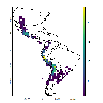
plot(cns, "nspp", col=rev(terrain.colors(25)), breaks=c(1,5,10,20,30,40,90))
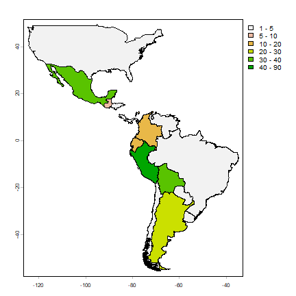
The map shows that Peru is the country with most potato species, followed by Bolivia and Mexico. We can also tabulate the number of occurrences of each species by each country.
tb <- table(v[ c('COUNTRY', 'SPECIES')])
# a big table
dim(tb)
## [1]  16 195
# show two columns
tb[,2:3]
##                SPECIES
## COUNTRY         S. achacachense Cßrdenas S. acroglossum Juz.
##   ARGENTINA                            0                   0
##   BOLIVIA                              8                   0
##   BRAZIL                               0                   0
##   CHILE                                0                   0
##   COLOMBIA                             0                   0
##   COSTA RICA                           0                   0
##   ECUADOR                              0                   0
##   GUATEMALA                            0                   0
##   HONDURAS                             0                   0
##   MEXICO                               0                   0
##   PANAMA                               0                   0
##   PARAGUAY                             0                   0
##   PERU                                 0                   6
##   UNITED STATES                        0                   0
##   URUGUAY                              0                   0
##   VENEZUELA                            0                   0
Because the countries have such different sizes and shapes, the comparison is not fair (larger countries will have more species, on average, than smaller countries). Some countries are also very large, hiding spatial variation. The map the number of species, it is in most cases better to use a raster (grid) with cells of equal area, and that is what we will do next.
Projecting spatial data
To use a raster with equal-area cells, the data need to be projected to an equal-area coordinate reference system (CRS). If the longitude/latitude date were used, cells of say 1 square degree would get smaller as you move away from the equator: think of the meridians (vertical lines) on the globe getting closer to each other as you go towards the poles.
For small areas, particularly if they only span a few degrees of longitude, UTM can be a good CRS, but it this case we will use a CRS that can be used for a complete hemisphere: Lambert Equal Area Azimuthal. For this CRS, you must choose a map origin for your data. This should be somewhere in the center of the points, to minimize the distance (and hence distortion) from any point to the origin. In this case, a reasonable location is (-80, 0).
# the CRS we want
laea <-"+proj=laea  +lat_0=0 +lon_0=-80"
clb <- project(cn, laea)
pts <- project(sp, laea)
plot(clb)
points(pts, col='red', cex=.5)
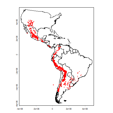
Note that the shape of the countries is now much more similar to their shape on a globe than before we projected You can also see that the coordinate system has changed by looking at the numbers of the axes. These express the distance from the origin (-80, 0) in meters.
Species richness
Let’s determine the distribution of species richness using a raster. First we need an empty ‘template’ raster that has the correct extent and resolution. Here I use 200 by 200 km cells.
r <- rast(clb)
# 200 km = 200000 m
res(r) <- 200000
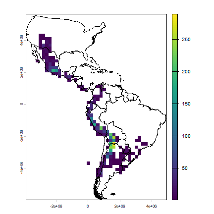
Now compute the number of observations and the number of species richness for each cell.
rich <- rasterize(pts, r, "SPECIES", function(x, ...) length(unique(na.omit(x))))
plot(rich)
lines(clb)
Now we make a raster of the number of observations.
obs <- rasterize(pts, r, field="SPECIES", fun=function(x, ...)length((na.omit(x))) )
plot(obs)
lines(clb)
A cell by cell comparison of the number of species and the number of observations.
plot(obs, rich, cex=1, xlab="Observations", ylab="Richness")
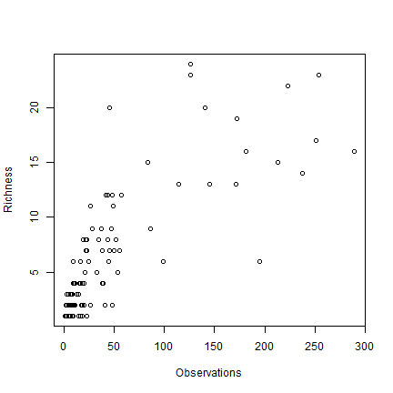
Clearly there is an association between the number of observations and the number of species. It may be that the number of species in some places is inflated just because more research was done there.
The problem is that this association will almost always exist. When there are only few species in an area, researchers will not continue to go there to increase the number of (redundant) observations. However, in this case, the relationship is not as strong as it can be, and there is a clear pattern in species richness maps, it is not characterized by sudden random like changes in richness (it looks like there is spatial autocorrelation, which is a good thing). Ways to correct for this ‘collector-bias’ include the use of techniques such as ‘rarefaction’ and ‘richness estimators’.
There are often gradients of species richness over latitude and altitude. Here is how you can make a plot of the latitudinal gradient in species richness.
d <- v[, c('lat', 'SPECIES')]
d$lat <- round(d$lat)
g <- tapply(d$SPECIES, d$lat, function(x) length(unique(na.omit(x))) )
plot(names(g), g)
# moving average
lines(names(g), raster::movingFun(g, 3))
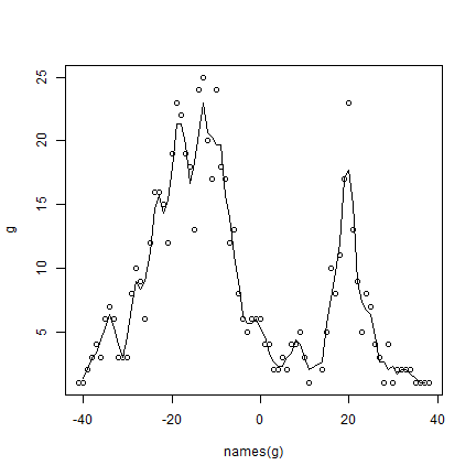
** Question ** The distribution of species richness has two peaks. What would explain the low species richness between -5 and 15 degrees?
Range size
Let’s estimate range sizes of the species. Hijmans and Spooner use two ways: (1) maxD, the maximum distance between any pair of points for a species, and CA50 the total area covered by circles of 50 km around each species. Here, I also add the convex hull. I am using the projected coordinates, but it is also possible to compute these things from the original longitude/latitude data.
Compute maxD for each species
spp <- unique(pts$SPECIES)
maxD <- rep(NA, length(spp))
for (s in 1:length(spp)) {
# get the coordinates for species 's'
p <- pts[pts$SPECIES == spp[s], ]
if (nrow(p) < 2) next
# distance matrix
d <- as.matrix(distance(p))
# ignore the distance of a point to itself
diag(d) <- NA
# get max value
maxD[s] <- max(d, na.rm=TRUE)
}
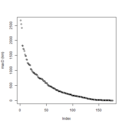
# Note the typical J shape
plot(rev(sort(maxD))/1000, ylab="maxD (km)")
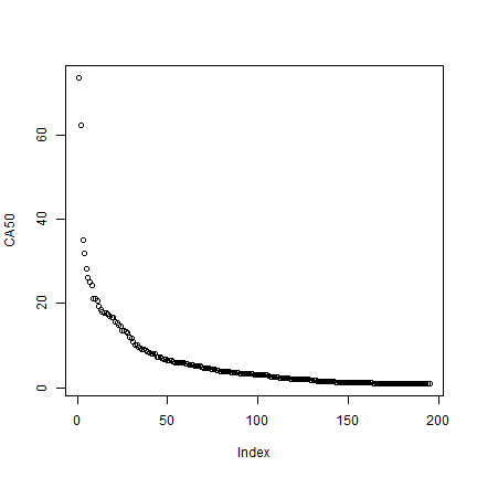
Compute CA
CA <- rep(NA, length(spp))
for (s in 1:length(spp)) {
    p <- pts[pts$SPECIES == spp[s], ]
    # run "circles" model
    m <- aggregate(buffer(p, 50000))
    CA[s] <- expanse(m)
}
# standardize to the size of one circle
CA <- CA / (pi * 50000^2)
plot(rev(sort(CA)), ylab='CA50')
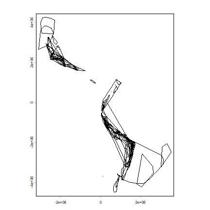
Make convex hull range polygons
hull <- list()
for (s in 1:length(spp)) {
    p <- unique(pts[pts$SPECIES == spp[s], ])
    # need at least three (unique) points for hull
    if (nrow(p) > 3) {
        h <- convHull(p)
        if (geomtype(h) == "polygons") {
        hull[[s]] <- h
        }
    }
}
Plot the hulls. First remove the empty hulls (you cannot make a hull if you do not have at least three points).
# which elements are NULL
i <- which(!sapply(hull, is.null))
h <- hull[i]
# combine them
hh <- do.call(rbind, h)
plot(hh)
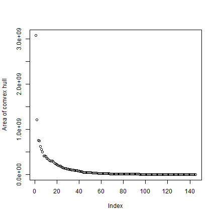
Get the area for each hull, taking care of the fact that some are NULL.
ahull <- expanse(hh)
plot(rev(sort(ahull))/1000, ylab="Area of convex hull")
To get a value (even if NA) for all species
cHull <- rep(NA, length(spp))
cHull[i] <- ahull
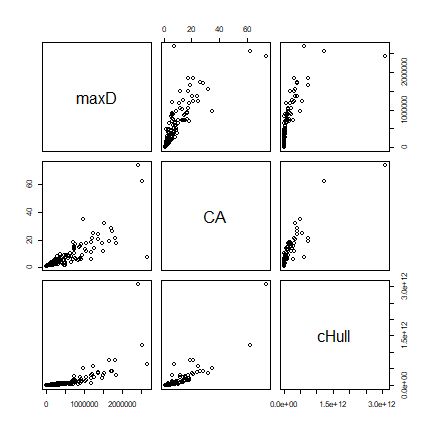
Compare all three measures
d <- cbind(maxD, CA, cHull)
pairs(d)
Exercises
Exercise 1. Mapping species richness at different resolutions
Make maps of the number of observations and of species richness at 50, 100, 250, and 500 km resolution. Discuss the differences.
Exercise 2. Mapping diversity
Make a map of Shannon Diversity H for the potato data, at 200 km resolution.
First make a function that computes Shannon Diversity (H) from a vector of species names
H = -SUM(p * ln(p))
Where p is proportion of each species
To get p, you can do
vv <- as.vector(table(v$SPECIES)) p <- vv / sum(vv)
now use the function
Exercise 3. Mapping traits
There is information about two traits in the data set in field PRLV (tolerance to Potato Leaf Roll Virus) and frost (frost tolerance). Make a map of average frost tolerance.
References
Hijmans, R.J., and D.M. Spooner, 2001. Geographic distribution of wild potato species. American Journal of Botany 88:2101-2112